How to Add Text to Video: A Complete Step-by-Step Guide
Learn how to add text to video with our step-by-step guide. We cover styling, timing, animation, and tips for creating beautiful tribute videos on any device.
You’ve got a video clip that should feel complete. Maybe it’s a short memorial montage, a birthday reel built from old phone photos, or a single animated portrait that already has beautiful movement. But when you play it back, something’s missing.
That missing layer is often text.
Not loud text. Not ad-style text flying across the frame. Just the right words, placed with care, so the viewer understands who they’re seeing, what moment matters, and why the clip deserves to hold attention for a few extra seconds. When you add text to video well, it doesn’t feel pasted on. It feels like part of the story.
Table of Contents
- Why Adding Text to Your Video Is Essential
- Choosing Your Toolkit for Adding Text to Video
- The Fundamental Steps to Place Text on a Video
- Designing Text for Readability and Accessibility
- Timing and Animating Text for a Professional Finish
- Putting It All Together for a Meaningful Tribute Video
Why Adding Text to Your Video Is Essential
A moving image can carry mood. It can suggest memory, warmth, grief, celebration, or nostalgia. But mood alone doesn’t always deliver meaning.
Text closes that gap. A name, a date, a short phrase, or a single line of context can turn a nice-looking clip into something that lands emotionally. That matters even more when the viewer isn’t listening with sound on.
Research summarized in this captioning discussion found that 80% of viewers are more likely to watch an entire video when captions are provided, and that 85% of videos on Facebook are watched without sound. If your message lives only in the soundtrack, a large part of your audience never receives it.
Text does two jobs at once
First, it helps people understand the video immediately. That’s practical. If you’re making a tribute, text can identify a person, mark a year, or frame a memory without forcing the viewer to guess.
Second, it shapes tone. “Forever in our hearts” reads very differently from “Best weekend ever.” The font, pacing, and placement all tell the viewer how to feel.
Practical rule: If the clip still makes sense with audio muted, your text is doing real work.
That’s why text isn’t an afterthought. It’s part of the edit itself.
Silent viewing changes how good video works
Creators often focus on transitions, color, and music first. Those matter. But for social clips, family reels shared in chat threads, and memorial videos watched on phones, text often carries the clearest signal.
A simple overlay can do what a soundtrack can’t. It can make the story understandable in a waiting room, on a train, or during a quiet late-night rewatch when someone doesn’t want to turn the volume up. For meaningful projects, that quiet usability matters as much as style.
Choosing Your Toolkit for Adding Text to Video
The best tool depends less on features and more on the kind of project you’re making. A fast birthday Story edit needs a different setup than a polished remembrance video you’ll show at a service or send to family.
This comparison helps narrow it down.
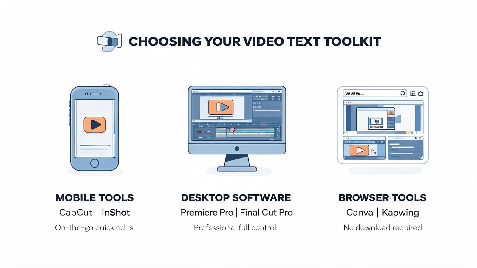
Three tool categories that cover most needs
| Tool type | Best for | Strengths | Trade-offs |
|---|---|---|---|
| Mobile apps like CapCut or InShot | Quick social edits, simple reels, on-phone work | Fast, convenient, easy text presets | Less precise placement and styling control |
| Web editors like Canva or VEED | Casual desktop editing, team sharing, simple tribute projects | Friendly interface, templates, easy exports | Can feel limiting when you want nuanced animation |
| Desktop software like DaVinci Resolve or Premiere Pro | Detailed montage work, layered timelines, custom text motion | Maximum control over timing, masking, fonts, and keyframes | Steeper learning curve and slower setup |
A lot of people start on mobile because it removes friction. That’s smart when speed matters. If you’re editing a family birthday reel on the same phone that holds the footage, CapCut or InShot may be all you need.
Web editors sit in a comfortable middle. They’re easier to learn than full desktop apps, and they’re often enough for lower thirds, title cards, and clean caption overlays.
When advanced software is worth it
Desktop editors earn their keep when the text needs to feel subtle and precise. Tribute videos are a good example. You may want to nudge text a little higher to avoid someone’s face, fade it in slowly, or line it up with a music cue. That’s where DaVinci Resolve and Premiere Pro feel much less cramped.
A few practical differences matter:
- Font control: Desktop tools usually handle installed fonts better.
- Animation: You get finer motion control instead of preset-only effects.
- Layering: It’s easier to stack background blur, photo movement, and text without losing track of the timeline.
If you’re making something people may keep and rewatch, the extra control usually pays off.
File compatibility is usually the easy part
Most editors accept standard MP4 files, which makes it simple to bring in animated clips from other tools. If you're starting from a single-photo animation workflow, a photo to video maker that exports MP4 fits smoothly into mobile, web, or desktop editing.
That means your decision can focus on editing comfort, not file drama. Import the clip, place the text layer above it, and work from there.
The Fundamental Steps to Place Text on a Video
Every editor labels things a little differently, but the core process is almost always the same. You import the clip, create a text layer, type your words, then adjust position, size, and timing.
Once you understand that pattern, switching tools gets much easier.
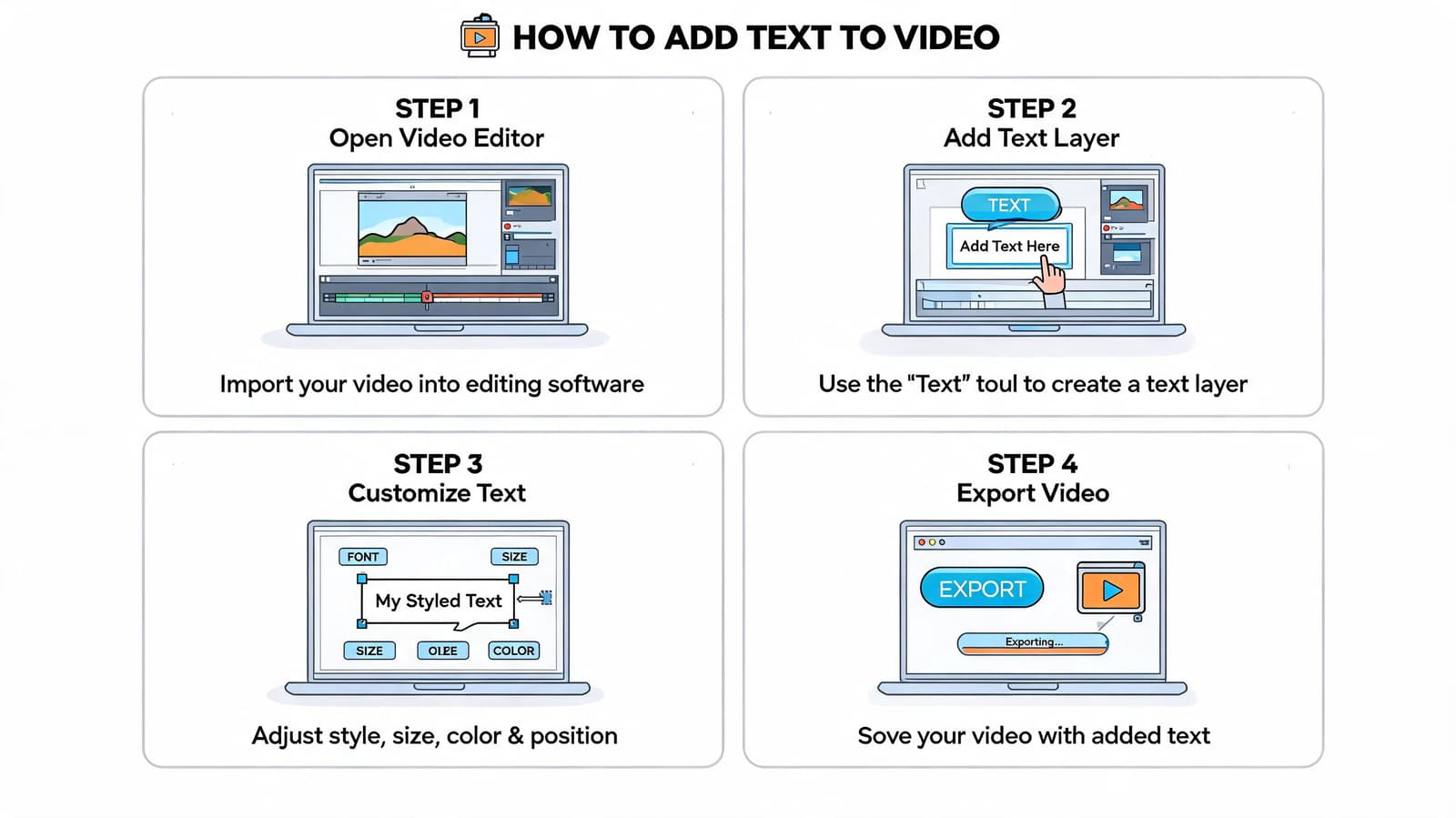
Start with the clip and timeline
Bring your video into the editor first. Drop it onto the timeline and watch it through before touching the text controls.
That viewing pass matters. You’re looking for two things: where the eye naturally rests, and where the image already feels emotionally strongest. In a tribute clip, that could be the moment the face is most centered or the movement is most gentle.
Then add a text element. In most apps, this appears as a separate layer above the video. That layer can be trimmed, moved, duplicated, and restyled independently from the footage.
Add the words before styling them
Type the actual message early. Don’t start by auditioning fonts for a blank box.
Good first-pass text usually falls into one of these categories:
- Identification text: A name, relationship, or place.
- Memory text: A short phrase tied to the moment.
- Context text: Dates, occasion, or a brief line of tribute.
Keep it short. The more emotionally important the clip, the less text it usually needs. One clean line tends to feel stronger than a paragraph floating over a face.
Write the line as if someone will only see it once, on a phone, in silence.
Adjust placement, size, and duration
After the words are in place, move the text away from key visual details. Lower thirds often work well because they keep the center of the frame clear, but that isn’t a rule. If someone’s hands or expression matter most, move the text somewhere quieter.
Then set the duration. Make sure the text stays on screen long enough to read without effort. If it disappears too quickly, viewers spend their attention catching up instead of feeling the moment.
How AI-generated clips fit into this workflow
If your starting point is an AI-animated photo, there’s one extra step before editing. You write a motion prompt first, then generate the clip, then add text in your editor.
In text-to-video workflows, semantic parsing interprets prompts for motion and style. According to this text-to-video workflow analysis, well-structured prompts achieve 85-90% alignment with user intent, while vague inputs can drop success rates to 60%. The same source notes that halving denoising diffusion steps can cut generation costs by nearly 50%.
That lines up with practical editing experience. “Slow push in, warm nostalgic tone, natural movement” gives you something usable. “Make it cinematic” usually doesn’t.
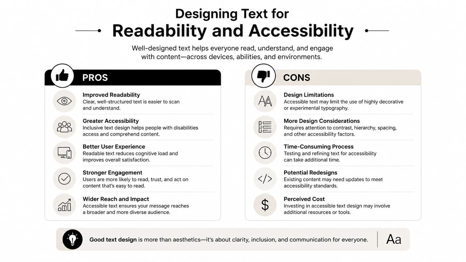
Designing Text for Readability and Accessibility
Stylish text that can’t be read is failed text. The best-looking overlay is the one the viewer understands instantly, without squinting, pausing, or replaying the clip.
Many edits commonly falter at this stage. The creator picks a beautiful script font, drops it on a bright background, shrinks it to keep the frame “clean,” and ends up with text that disappears on mobile.
Pick fonts that match the project and survive the screen
For tribute work, serif fonts can feel traditional and gentle. Sans-serif fonts often feel clearer and more modern. Neither is automatically better.
The question is whether the font holds up at small sizes and over moving footage.
A practical rule set:
- Use clean letterforms: Avoid fonts with overly thin strokes or decorative swashes.
- Limit the mix: One primary font, maybe one accent font. More than that starts to look scrapbooked.
- Check mobile readability: If it’s hard to read on your own phone at arm’s length, it won’t improve for anyone else.
If your source footage is soft, old, grainy, or low-resolution, simpler fonts usually look more intentional. On fragile imagery, ornate type can compete with the photo instead of honoring it. If the footage itself needs cleanup, this guide on how to fix resolution helps before you start styling overlays.
Contrast is more important than decoration
A lot of text problems are really contrast problems. White text can look elegant until it crosses a pale sky, wedding dress, or faded scan. Black text can vanish into dark clothing or shadow.
Use support when you need it:
- Soft shadow for subtle separation
- Thin outline when the background changes constantly
- Semi-transparent text box when legibility matters more than visual purity
These choices aren’t compromises. They’re what make the text usable.
According to Rev’s closed captions statistics roundup, captioned videos show a 12% average increase in watch time. The same source notes that 85% of Facebook videos are watched muted, and that clear on-screen text boosts retention by as much as 40%. Readability isn’t just an accessibility concern. It directly affects whether people stay with the video.
Make accessibility part of the visual style
Accessibility doesn’t mean sterile design. It means removing friction.
Try this checklist before exporting:
- Mute the video and watch once. If the meaning still lands, you’re in good shape.
- View on a phone, not just a desktop monitor. That’s where weak contrast gets exposed.
- Pause at random frames. If the text becomes unreadable over a bright or busy moment, add support.
- Keep line length short. Shorter lines are easier to process and feel calmer in tribute edits.
Good text design lets the viewer feel the video, not fight the layout.
For personal projects, that’s the target. Clean, calm, readable, and respectful.
Timing and Animating Text for a Professional Finish
Text can be perfectly written and still feel amateur if it appears abruptly, leaves too fast, or moves like a sales ad. Motion needs to match the emotional temperature of the footage.
That’s especially true in tribute edits. Fast bounces, dramatic zooms, and aggressive kinetic presets pull attention toward the edit itself. In sentimental work, that’s usually the wrong direction.
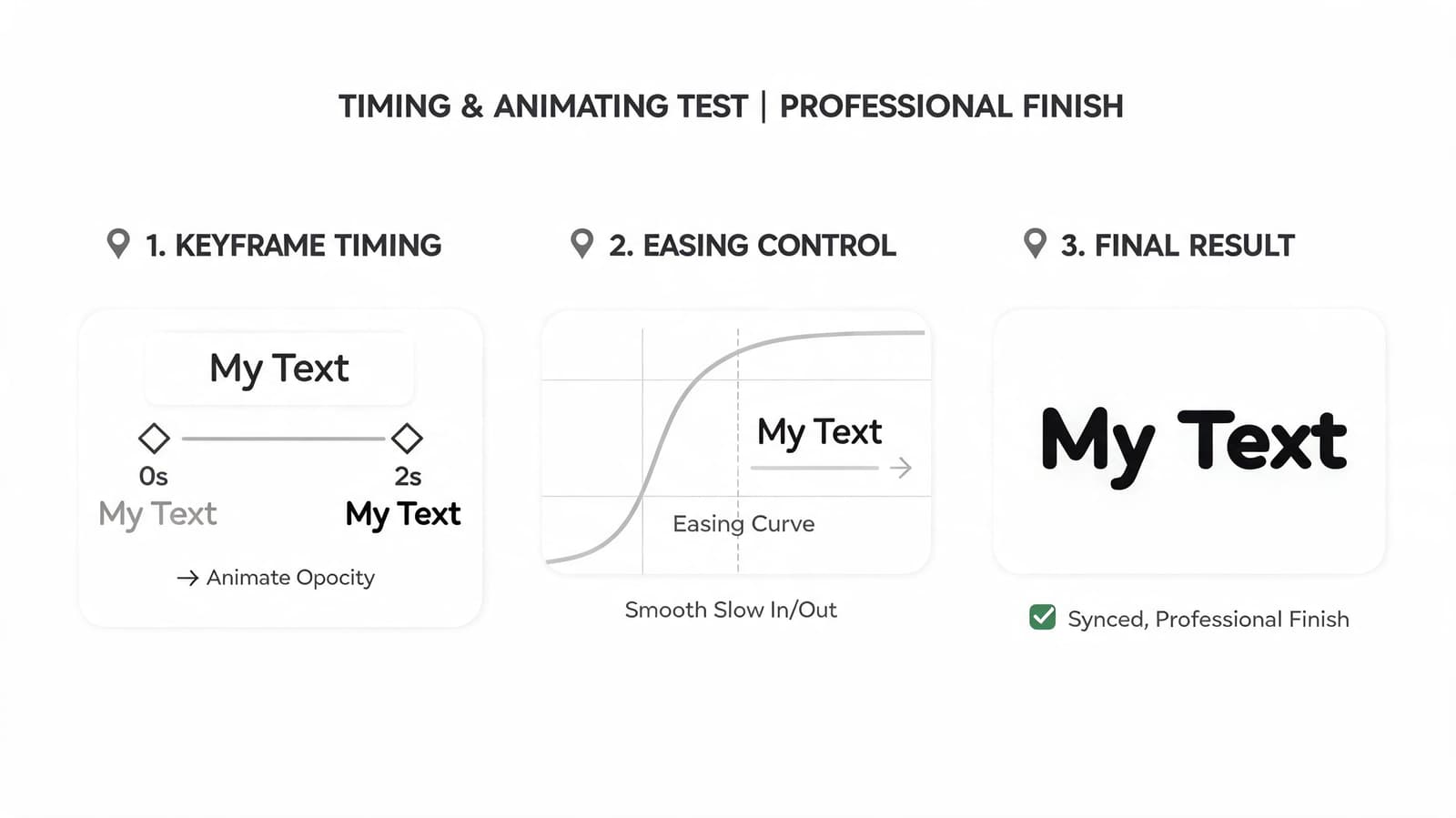
Use timing to support the viewer
Text should enter early enough to be read comfortably and leave late enough that it doesn’t feel snatched away. If the clip is short, resist the urge to animate every second of it.
A good working rhythm for meaningful edits is simple:
- Let the clip breathe for a moment.
- Bring text in gently.
- Hold it steady.
- Ease it out without drawing attention.
That steady middle is what many beginners skip. They animate in and animate out, but never let the title rest.
Think of keyframes like map pins
Keyframes are just markers that tell your editor where something starts and where it ends. Set one point for the text at the beginning of the move, another at the end, and the software fills in the motion between them.
You don’t need complex paths to get a polished result. A soft fade, a slight upward drift, or a barely noticeable scale change often feels more expensive than a flashy preset.
Here’s what tends to work best for tribute videos:
| Effect | Usually works | Usually doesn't |
|---|---|---|
| Fade in and out | Clean titles, memorial names, quiet captions | None, if kept subtle |
| Gentle drift | Background quotes, secondary text | Large moves across the full frame |
| Soft scale | Title cards over still or lightly animated photos | Punchy zooms or fast pops |
| Typewriter effects | Rarely, unless the style is intentionally nostalgic | Emotional remembrance edits |
A useful reminder comes from this tutorial analysis on tribute video text, which notes that many tutorials push flashy effects like skewing or 3D perspective while missing the needs of tribute videos. The same source emphasizes that overly dynamic text can reduce emotional impact, while viewers respond better to gentle, respectful animation that preserves the photo’s original texture and feel.
If the viewer notices the text effect before they notice the memory, the animation is too strong.
Easing matters more than complexity
Linear motion can feel mechanical. Most editors let you apply easing so the text starts and stops more naturally.
You don’t need to chase advanced motion design terms. Just avoid anything that snaps on or jerks to a stop. For sentimental projects, smoothness reads as care.
Putting It All Together for a Meaningful Tribute Video
A strong tribute edit often starts with one image that already carries emotion on its own. An old portrait. A candid from a birthday. A faded scan someone nearly forgot they had.
Turn that image into a short moving clip first. Then build the text around the emotional center of that motion, not the other way around.
A practical tribute workflow
Say you have a single photo of a grandparent. The image has a gentle camera move already. Not dramatic. Just enough motion to make the frame feel alive.
From there, the edit can stay simple:
- Import the clip into your editor.
- Trim it so the movement feels settled and natural.
- Add one line of text, such as a name or short tribute phrase.
- Place the text away from the face and away from any meaningful gesture in the image.
- Use a readable font with soft contrast support.
- Animate with a slow fade in and fade out.
That’s often enough.
The mistake many people make is trying to prove effort through complexity. More layers, more quotes, more motion, more fonts. A better tribute usually feels quieter than that.
Where AI helps and where judgment still matters
AI can remove a lot of grind from the process. In a tribute montage workflow, creators can reduce production time from 80% editing down to 20% by using AI tools, according to this text-to-video market report. The same source notes that, for these projects, text overlays can lift view times by up to 50%.
That doesn’t mean the tool makes the emotional decisions for you.
You still choose the line. You still decide whether the text should be centered or offset, whether it should appear immediately or after a short pause, and whether the final result feels dignified. Those aren’t technical settings. They’re editorial choices.
If you want a practical walkthrough focused on remembrance projects, this guide on creating a memorial video from photos is a helpful companion.
The most professional-looking tribute text is usually the least distracting text.
That’s the standard worth aiming for. Not flashy. Not overworked. Just clear, balanced, and emotionally right for the person or moment you’re honoring.
If you're turning a single treasured photo into a short video before adding your text overlays, Photo for Video makes that first step simple. It creates gentle 5 to 6 second MP4 clips from one still image, which fits neatly into tribute edits, birthday reels, and family keepsakes where tasteful text matters as much as motion.