Image Color Calibration: Perfect Your Photos & Videos
Master image color calibration for consistent, accurate photos & videos. Our guide covers monitor setup, ICC profiles, and scanned photos.

You're probably dealing with this right now. An old family photo looks warm and alive on your laptop, then turns flat on your phone. You fix it again, send it to a sibling, and they say everyone looks too pink. You export a tribute slideshow, play it on a TV, and the whites suddenly look blue.
That frustration usually isn't about your taste. It's about image color calibration. If the screen, source file, and editing process aren't speaking the same language, every correction becomes a guess. That gets even harder when you're working with faded prints, old scans, and phone photos of glossy albums, where the source is already compromised before you even open Photoshop or Lightroom.
For memory work, “close enough” often isn't close enough. If you're restoring a wedding portrait, a military photo, or a snapshot of a grandparent in the backyard, the job isn't to make it flashy. The job is to make it feel believable. Good calibration helps you do that consistently, without chasing color from device to device.
Table of Contents
- Why Your Colors Look Wrong and How to Fix It
- The Foundation Calibrating Your Monitor
- Understanding and Using ICC Profiles
- Calibrating Your Source From Cameras to Scans
- Color Correction Best Practices
- Final Checks and Troubleshooting Common Issues
Why Your Colors Look Wrong and How to Fix It
Most color problems start with a simple mismatch. Your screen shows one version of the image, your phone shows another, and a relative's tablet shows something else again. If you edit by feel on an uncalibrated display, you're correcting to a moving target.
That's why image color calibration matters. It replaces “that looks about right” with a process you can repeat. The core workflow is straightforward: capture a standardized chart, compare it to known reference values, compute the color difference, then tune settings to reduce error, as described in Basler's overview of color calibration. That shift is what turned color work from a subjective craft into something measurable.
What this looks like in real life
A common example is an old print with yellowing paper and weak blues. On an overly cool laptop screen, you might add warmth because the image feels sterile. Then you check it on another device and realize you've doubled the cast instead of removing it.
The same thing happens with skin. If your display is too bright, you'll often darken the photo too much. If the white point is off, you'll chase magenta or green in faces that were fine to begin with.
Practical rule: If a photo looks “different everywhere,” stop editing and question the display before you question your judgment.
For family photos, this matters more than people think. Memory images are usually judged by recognition, not by technical perfection. Everyone knows when dad's jacket wasn't that blue, or when grandma's skin tone feels strange. Calibration doesn't make old photos flawless. It gives you a stable baseline so your decisions stay consistent.
The fix is less glamorous than people expect
It usually comes down to three things:
- Trust the screen first: If the monitor is wrong, every edit after that is compensation.
- Start with the source, not filters: A bad scan or phone capture often bakes in the cast.
- Use a repeatable check: Compare, validate, and revisit rather than editing by memory alone.
Color calibration isn't only for studio photographers and print labs. It's for anyone who wants one careful correction to hold up across devices, exports, and video timelines. That's the difference between a photo that merely looks edited and one that still feels like the original memory.
The Foundation Calibrating Your Monitor
You can't correct color accurately on a screen that lies to you. That sounds blunt, but it's the heart of the whole workflow. Before touching curves, HSL, or restoration tools, get the monitor into a reliable state.
Why the monitor comes first
A display can drift gradually. Brightness changes. White balance shifts. Room lighting changes how your eyes perceive the screen. If you edit a faded print on a screen that runs too bright, you'll usually underexpose the final file. If the monitor leans cool, you'll warm every image and wonder why they look orange elsewhere.
This is the first decision point one faces.
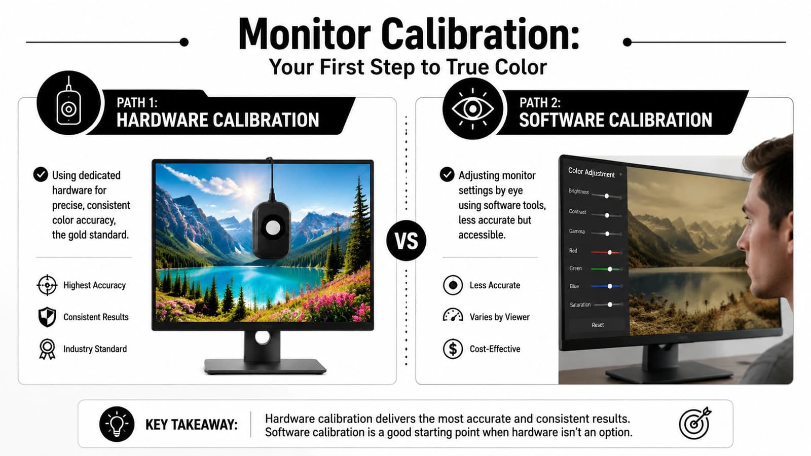
Hardware versus software
The gold standard is hardware calibration with a colorimeter such as a Calibrite or Spyder device. You warm up the display, connect the meter, choose the correct display type, then work through brightness, contrast, and RGB gain adjustments during measurement. After profiling, you validate the result against a 24-patch set. One practical benchmark is average Delta E below 1 and maximum patch error below 2, as described in this monitor calibration guide from Mibreit Photo.
The practical upside is trust. You stop second-guessing whether the screen is the problem.
The other path is software-only calibration using operating system tools and visual test patterns. It's better than doing nothing. You can reduce the worst issues, especially if your current screen is wildly too bright or tinted. But it depends on your eyes, your room, and your habits on that particular day.
Here's the trade-off in plain terms:
| Method | What it does well | Where it falls short |
|---|---|---|
| Hardware calibration | Produces a measured display profile you can rely on | Requires buying a device and taking time to validate |
| Software calibration | Improves obvious problems quickly and cheaply | Can't measure color with the same precision |
A lot of talented editors stay stuck because they keep trying to out-edit a bad display. That rarely works.
If you make frequent skin-tone decisions, hardware calibration pays for itself in confidence long before it pays for itself in convenience.
A walkthrough helps if this is your first time:
What a good calibration result looks like
If you're using hardware, don't stop after the software says “done.” Validate it. That report tells you whether the profile is useful.
Look for a setup that's stable and repeatable:
- Warm up the display: A cold monitor can behave differently from one that's been on for a bit.
- Check the environment: Screen savers, power saving, and inconsistent signal range can compromise the result.
- Adjust manually when prompted: Skipping brightness or RGB gain adjustments weakens the profile.
If you don't own a colorimeter yet, do the next best thing. Lower an overly bright screen, disable attention-grabbing display enhancements, and edit in consistent room light. That won't give you measurement-grade accuracy, but it will remove some of the worst variables.
Understanding and Using ICC Profiles
Once the display is calibrated, the next piece is the file itself. When people hear “ICC profile” in this context, they often assume the topic is more technical than it really is. It isn't.
Think of ICC profiles as translation files
An ICC profile tells a color-managed app how a device represents color. Your monitor profile tells Photoshop, Lightroom, and other managed software how to display the file accurately on your particular screen. Without that translation, the app is making assumptions.
There's a deeper layer here that matters more than most tutorials admit. A strong workflow starts before creative edits with linearization, which means shaping the data so it behaves as a linear representation of captured light, often with a separate model for each color channel, as discussed in this technical workflow on image standardization and linearization. In practical terms, it means the foundation is corrected before you start making aesthetic judgments.
For everyday editing, you don't need to build scientific tooling from scratch. You do need to understand the order of operations. Profile the display. Open files in a color-managed app. Keep your edits inside a sensible working space. Export intentionally.
Working spaces that make practical sense
For most family-photo restoration, web sharing, and video use, sRGB is the safest default. It's not the largest color space, but it's the least surprising across phones, browsers, and general viewing conditions.
A simple way to think about common spaces:
- sRGB: Best when the final image is headed for web, social, slideshows, or general video workflows.
- Adobe RGB: Useful when your process leans toward print and you know the rest of the chain supports it.
- ProPhoto RGB: Best left to controlled editing environments where you understand the risks and are preserving maximum headroom.
The mistake isn't choosing the “wrong” space in theory. It's choosing a large space casually, then exporting for everyday viewing without managing the handoff.
A profile doesn't improve a bad edit. It makes sure the edit you made is the edit other color-managed devices are trying to show.
If you're restoring old photos, keep the goal in mind. You're usually not trying to extract every possible saturated color from the file. You're trying to preserve believable skin, clothing, paper texture, and period character while making the image hold together on common screens.
Calibrating Your Source From Cameras to Scans
Good color starts before the file reaches the editor. If the source capture is unstable, every correction later becomes more invasive than it needs to be.
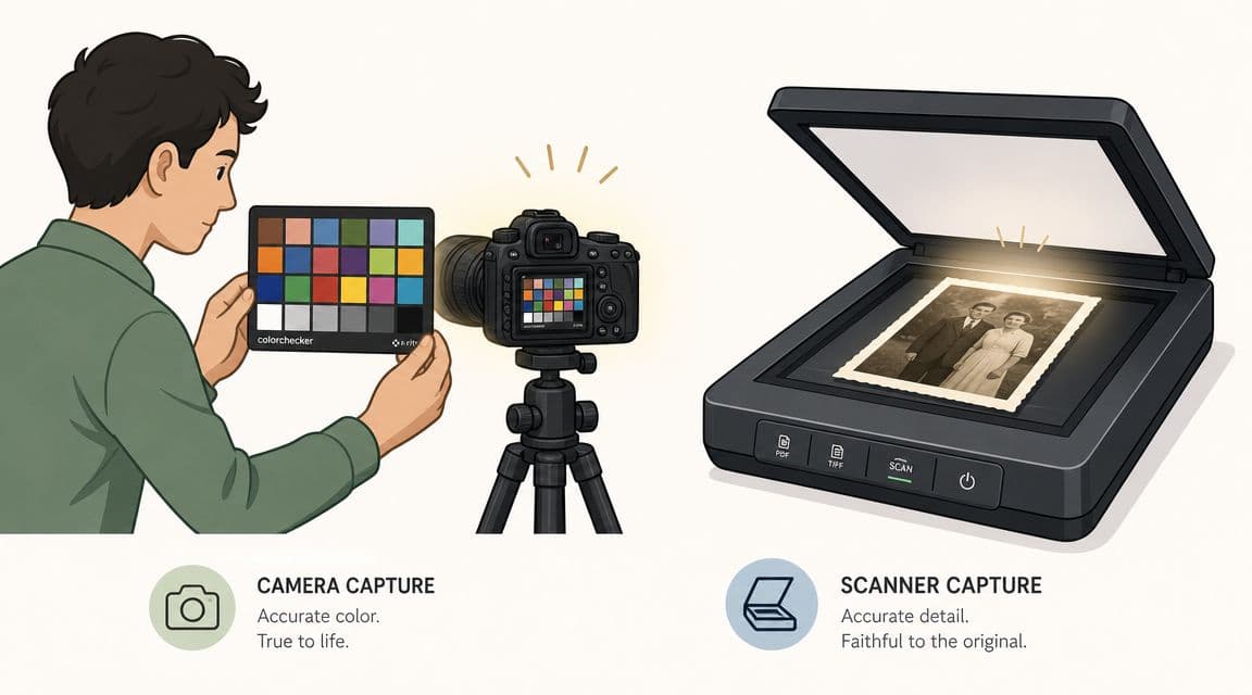
For camera files
With digital cameras, the cleanest route is chart-based profiling. Modern profiling commonly uses a 3×3 color correction matrix, and software can calculate it from a test chart with at least 9 distinct color patches. The point isn't just visual tuning. It's a mathematical transform that minimizes mean squared color error against the chart's reference values, as explained in Imatest's documentation on color matrices.
That matters because cameras don't all “see” color the same way. Even good cameras have their own signature. A custom profile gives you a neutral starting point before taste enters the process.
A practical capture routine looks like this:
- Photograph a color chart in the same light as your subject.
- Build the profile in your profiling software.
- Apply that profile as your baseline in Lightroom, Adobe Camera Raw, or similar software.
- Make creative edits only after the baseline is stable.
If you skip the chart and try to fix everything with white balance alone, you can improve the image, but you won't correct the camera's full color response.
For old prints and scans
In such cases, standard advice often breaks down. You're not dealing with a fresh RAW file. You're dealing with paper aging, scanner bias, album plastic, uneven room light, and sometimes a phone camera pointed at a curled print on a kitchen table.
Start with capture discipline:
- Use the most controlled light you can: Window light can work if it stays consistent, but mixed room light is a troublemaker.
- Keep the print flat: Curled edges create uneven tone and color.
- Avoid glossy reflections: Tilted glare can look like lost highlight detail.
- Include a reference when possible: A gray card helps if you're re-photographing a print.
If you're photographing a print instead of scanning it, resolution also matters. A weak capture makes color work harder because texture and edge detail break apart first. If you need a practical starting point, this guide on getting a high-resolution photo for restoration and reuse covers the capture side well.
Sometimes you won't have a chart or gray card. Then I use what I call a memory neutral. Not a technical neutral, but something in the image that should behave calmly. A white shirt in shade. A wedding veil. A concrete sidewalk. A neutral wall. It's imperfect, but it's often enough to remove the worst cast before finer adjustments.
Old photos don't need aggressive correction first. They need a believable baseline that keeps the paper, grain, and era intact.
For flatbed scans, check the scanner software too. Auto-enhance features often add contrast, saturation, or “helpful” correction that bakes in problems before you open the file. Turn those extras off when you want a cleaner master.
Color Correction Best Practices
Once the monitor is trustworthy and the source is captured sensibly, editing gets much easier. The biggest mistake here is using powerful tools in the wrong order. That's how photos end up crunchy, over-warmed, and oddly modern.
Use an editing order that protects the image
A steady workflow works better than heroic one-click fixes.
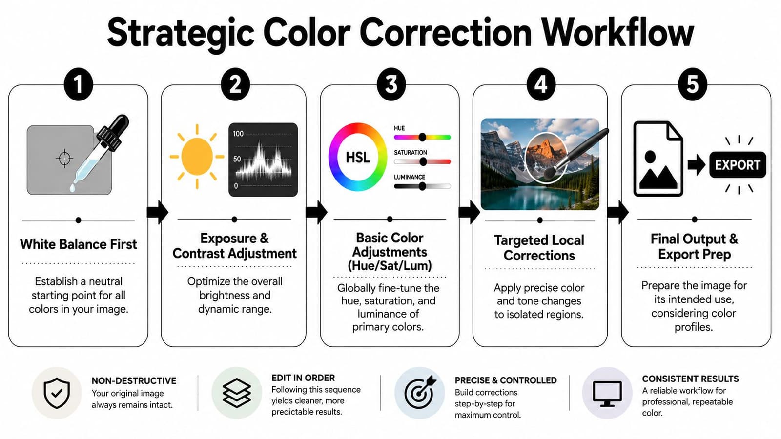
I like this sequence for difficult family photos:
- White balance first: Get the overall cast under control before touching contrast.
- Then exposure and curve shape: Fix brightness and tonal separation once the color isn't fighting you.
- Use HSL carefully: Fine-tune problem colors rather than pushing global saturation.
- Make local corrections: Faces, clothing, and background paper often need different treatment.
- Export for the destination: A restoration master and a video-ready copy are not always the same file.
The reason this order works is simple. White balance changes how every later decision feels. If you add contrast before neutralizing a cast, you usually lock the cast in harder. If you push saturation before fixing brightness, skin starts to look plastic.
A useful habit is to protect skin tones before you beautify the rest. In portraits, viewers forgive some background imperfection. They don't forgive strange faces. If one area must stay natural, make it the skin.
For old prints, restraint matters. You're not trying to erase every sign of age. Slight paper warmth, gentle grain, and soft contrast often belong to the image. If you sharpen heavily and deepen blacks too far, the photo may look “better” in a technical sense and worse as a memory.
If you're dealing with badly damaged originals, this article on old photo recovery and restoration choices is a helpful companion for deciding what to fix and what to leave alone.
What to do when there is no neutral gray
Some images don't offer a clean white shirt, gray wall, or chart. They have mixed light, faded dyes, or color shifts from age. In those files, white-balance eyedroppers can become guesswork.
A fast workaround is to blur the image until you're seeing its overall average color, then neutralize that average with curves. That method is described in this practical color-correction technique from AP Almanac. It mimics the way auto white balance looks at scene statistics.
That doesn't solve everything. It can't know which person's skin tone you're trying to honor, or whether a faded dress was blue or lavender. But it's a strong way to remove a broad cast when there's no obvious neutral anchor.
Here's where that method works well:
| Situation | Why it helps |
|---|---|
| Old scans with yellow paper cast | It removes overall bias before finer edits |
| Phone photos under mixed indoor light | It gives you a saner starting point than guessing with sliders |
| Album snapshots with no reliable neutral object | It reduces the scene-wide cast without forcing a fake white point |
Final Checks and Troubleshooting Common Issues
By this stage, most of the heavy lifting is done. The remaining problems are usually the annoying ones. The image looked right in the editor, then drifted in the browser, print, or video export.
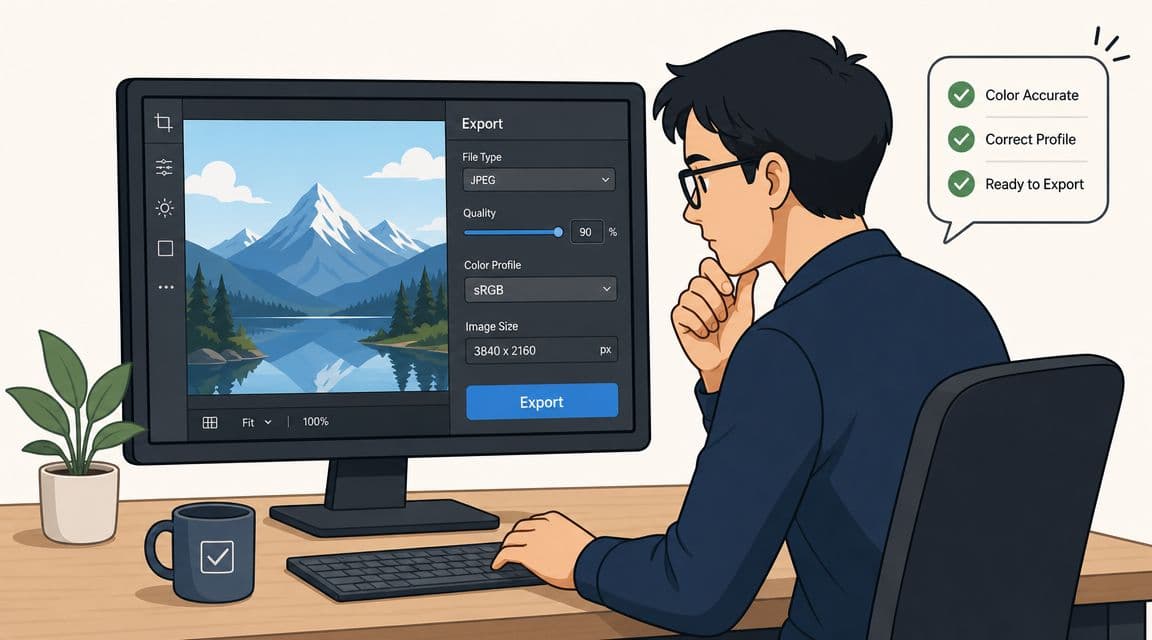
Before you export
The last mile matters because color management often falls apart at this stage. A carefully corrected file can still shift if you export it carelessly or hand it to software that interprets color differently.
Use a short final checklist:
- Match the export to the destination: For web and general video delivery, sRGB is usually the least risky handoff.
- Check the app that will display it: Some apps are color-managed well, others less so.
- Review on more than one screen: Not to chase every device, but to catch obvious surprises.
- Keep a master file: Export delivery copies from a stable edited original.
If the image is headed into a video project, compression can also change how subtle textures and tonal transitions feel. That doesn't create a color-management problem by itself, but it can exaggerate one. This guide on YouTube video compression and export considerations is useful when you want your final visuals to survive delivery platforms more gracefully.
Why calibration still seems to fail
A lot of people assume every color inconsistency is a software problem. Often it isn't. Sometimes the issue happened before the file was even made.
Research in medical imaging found that changing camera distance and angle increased variability in photographed skin appearance over time, and the authors note that consistent geometry helps reduce color-correction and device-calibration errors, as discussed in this study on image capture consistency and skin photography. That lesson carries over surprisingly well to old-photo digitization.
If you re-photograph prints on different days with different angles, different phone heights, and different light positions, your calibration won't “stick” because the capture itself keeps changing.
Calibration can't rescue a moving target. If the setup shifts every time, the color shifts with it.
Common problems and the real fix
Here's a practical troubleshooting map:
-
Prints don't match the screen
Soft proofing is usually the missing step. The display may be accurate, but paper and printer behavior still differ from a backlit monitor.
-
Colors shift after posting online
This is often an export or color-space handoff problem. A file prepared in one space can look odd when a browser or app expects something else.
-
Faces look good on one device and too red on another
Check whether your screen is too warm, too saturated, or much brighter than the devices other people use.
-
A restoration looks different every time you reopen it
Recheck the monitor state, room light, and whether display enhancement features were turned back on.
-
Two photos from the same album need wildly different fixes
Don't assume that means your workflow failed. Old prints age differently, and one may have been scanned or photographed under different conditions.
A final practical habit helps more than any fancy tool. Build a small set of reference images you know well. Not internet test images. Your own files. A portrait with believable skin, a black-and-white print with clean neutrals, one tricky faded color print, maybe one wedding dress shot. When your workflow drifts, those references expose it quickly.
Good image color calibration doesn't mean every image becomes identical across every screen on earth. It means your corrections become predictable, your files survive handoff better, and your old family photos keep their emotional truth instead of picking up accidental color baggage.
If you've restored a meaningful photo and want to turn it into something more moving than a static frame, Photo for Video makes that next step simple. It transforms a single image, including old scans and family keepsakes, into a short, natural-looking living memory that fits beautifully into tribute videos, anniversary edits, and memorial montages.