Black and White Coloring: Scan, Colorize and Animate
Black and white coloring done right: scan settings, AI and manual methods, and contrast checks before you animate a family photo.
You have the print on the kitchen table, a birthday or a memorial date coming up, and a grey picture that still holds a face everyone recognizes. One relative wants color. Another wants the print left alone. Both reactions are reasonable. Black and white coloring is not a quiet upgrade that makes an old photograph look new. It is an interpretation you label, check for legibility, and only then put into motion.
I would start with the cheapest fix that still protects the print: a careful scan, a locked grayscale master, and a color pass you can turn off. Color can make a face feel closer. It can also invent a coat, flatten paper grain, or hide a person in a shadow once the picture starts to move. The choices below are the ones worth making before a tribute clip leaves the house.
Table of Contents
- Scan Settings That Protect Black and White Detail
- AI and Manual Colorizing Options Compared
- How to Colorize a Black and White Photo Step by Step
- Keep the Analog Texture and Label the Color
- Check Contrast Before You Animate
- Animate One Photo Before You Build the Reel
Scan Settings That Protect Black and White Detail
The scan decides how much of the face, the handwriting, and the paper you still have later. Inspect the original first for fading, discoloration, handwriting, or photographic detail, because that check picks the mode. Then match the source to the settings below.
| Source | Scan mode | Resolution | Master file |
|---|---|---|---|
| Printed text or forms | Bitonal (black and white) | 300-600 ppi | TIFF, uncompressed or lossless |
| Glossy or matte photo print | 8-bit or 16-bit grayscale | 300-600 ppi | TIFF, uncompressed or lossless |
| Faded or damaged print | 16-bit grayscale or 24-bit color | 600 ppi (test 800 ppi) | TIFF, uncompressed or lossless |
| Phone capture of a print | Grayscale, even light | Full camera resolution | PNG or highest-quality JPEG |
Why the mode matters more than the resolution
Photographs are continuous tone. A bitonal setting keeps only two values, black and white, and throws away shadows, highlights, texture, and halftone detail. The University of Michigan Bentley digitization guidelines reserve that mode mainly for high-contrast printed text, and they note that standard 8-bit grayscale preserves 256 intensity levels. Use grayscale for glossy and matte prints, low-contrast marks, and anything faded.
Scan ordinary prints at 300–600 ppi and save the master as an uncompressed or losslessly compressed TIFF. Where the scanner allows it, keep 16-bit grayscale while you edit and convert to 8-bit only at final delivery. A damaged or heavily faded original often needs 16-bit grayscale or 24-bit color capture, because an 8-bit scan can clip information you might still recover.
Practical rule: "Black and white" on a scanner menu is not the same thing as grayscale. If the preview looks like a photocopy, you are in the wrong mode.
Test the scanner before a batch
Before you run a stack of albums, test your own device at 300, 400, 600, and 800 ppi. Check resolution, noise, gamma, and whether the tone stays even from corner to corner. A setting that looks clean on a glossy portrait can add noise on a thin snapshot.
Scanned photos, phone captures, and digitized prints can all be used, and cleaner images usually produce better motion. For a phone capture, lay the print flat, kill glare, and keep the lens square to the paper. If you want a fuller walkthrough of glass, cropping, and file naming, the guide on how to scan old photos covers the handling side. Stop when you have one master you would not be afraid to lose the working copy of.
AI and Manual Colorizing Options Compared
Four routes get used on family pictures. They differ in who chooses the color, how long the pass takes, and how much you can undo.
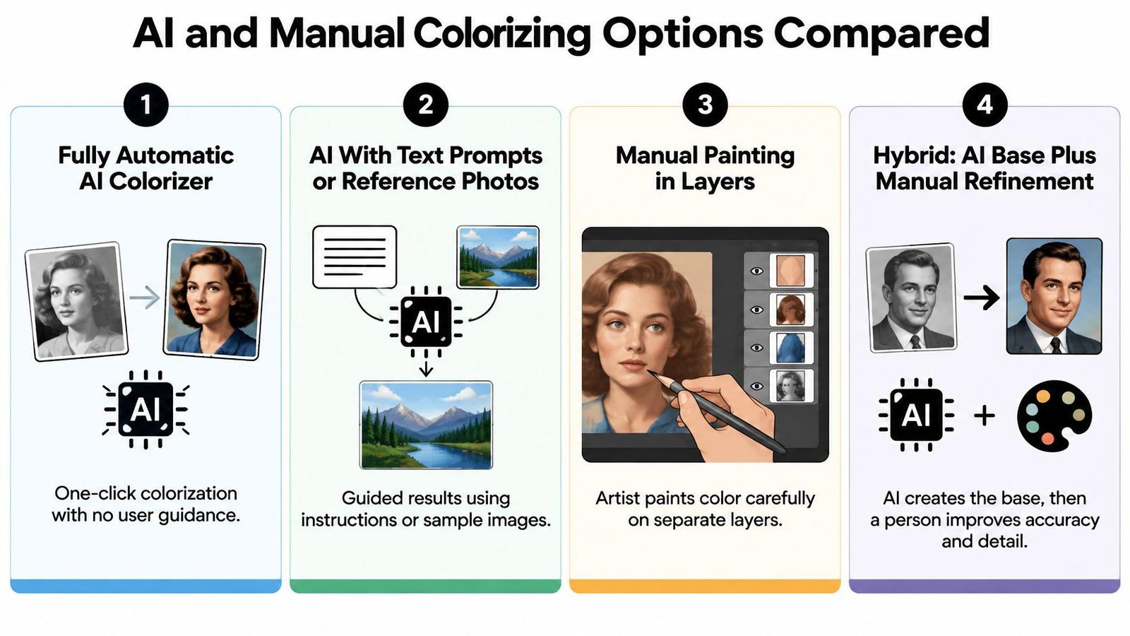
| Approach | Who sets the color | Effort | Control over result | Best for |
|---|---|---|---|---|
| Fully automatic AI colorizer | The model infers every color | Minutes | Low | Quick previews, not keepsakes |
| AI with text prompts or reference photos | You steer the palette with color cues | 30-90 minutes | Medium | Scenes with known clothing or setting |
| Manual painting in layers | You choose every color | Several hours | High | Portraits where skin and fabric matter most |
| Hybrid: AI base, manual correction | Model first pass, you fix faces and key objects | 1-2 hours | High | Most family tributes |
Fully automatic AI colorizer. One click, a few minutes, and a full-frame guess. That speed is useful when you only need to see whether a picture is worth more work. It is a poor keepsake method, because the model invents faces, walls, and clothing with no way for you to cite a memory.
AI with text prompts or reference photos. You supply a cue, such as "navy uniform" or a color snapshot of the same car from that decade. Control sits in the middle. This is the better automatic route for a crowded group, a street, or a room where one known object can anchor the rest.
Manual painting in layers. You pick every hue in Photoshop, Photopea, or a similar editor, usually with soft brushes on separate layers. It takes several hours and gives the highest control. Spend that time on a tight portrait where skin and fabric carry the feeling, not on a wide scene full of small objects.
Hybrid: AI base, manual correction. Let the model lay a first pass, then repaint faces, hands, and a few key objects. Plan on 1–2 hours. This is the method I would use for most family tributes. You keep the speed of a model and the right to reject a bad cheek or a cartoon coat.
Match the method to the picture
A single portrait favors hybrid or fully manual work. A crowded reunion favors a reference-steered tool, because painting every jacket by hand rarely changes the story. A fast preview for a birthday slideshow can accept the automatic result, as long as nobody treats it as the archive copy.
Animate only after the still is colored and checked. A motion tool cannot repair a bad palette, and a wrong skin tone gets more obvious once the face shifts.
How to Colorize a Black and White Photo Step by Step
Work from the untouched master to a labeled derivative. Do not color the file you would hand to an archive.
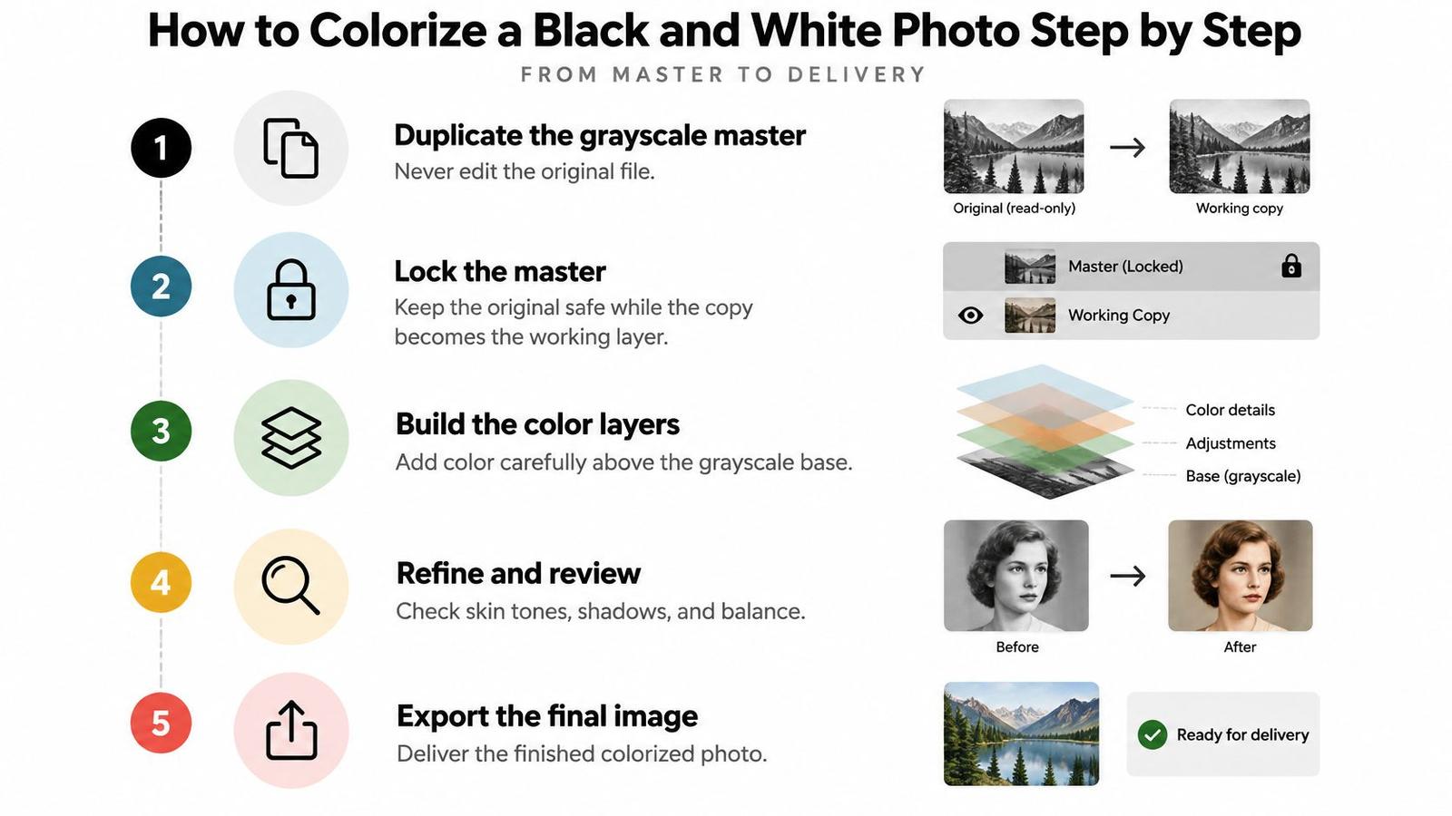
- Duplicate the grayscale master. Never paint on the original file. The copy is the working layer. The master stays locked as the luminance reference.
- Set exposure and the black and white points gently. The National Archives preservation technical guidelines treat tone as a measurable limit before any stylistic color. Avoid clipping highlights below about 3% black or shadows above about 97% black. Aggressive contrast erases facial detail and paper texture that a later model cannot reliably rebuild.
- Pick the method and apply it only to the copy. Use the route that fits the picture: automatic for a preview, prompted AI when you know a garment, manual or hybrid when the face matters.
- Build the palette from evidence. Family memory, a dated photo of the same clothing, or a neutral hue for anything unknown. A dress, a car, or a wall with no reference stays muted.
- Color large areas first. Sky, vegetation, and walls, then skin, then fabrics. Put each region on its own layer so you can hide a bad pass without undoing the rest.
- Blend color back toward the scan. Around 50 to 70 percent opacity lets paper and grain show through. If the picture looks like a postcard, the color is too strong.
- Check legibility before you export or animate. Look at edge detail, skin and cloth boundaries, and background separation at the file's native resolution. If the still will move, also check that the face stays consistent from one imagined moment to the next.
What usually goes wrong
The common slip is coloring the face before the palette is settled. An early skin tone gets copied onto hands and necks, and then the whole picture is locked to an invention. Monochrome generally does not uniquely determine original colors, so ambiguous regions need a conservative palette or an explicit choice you can explain.
When you deliver, export a derivative in a standard color space and compare it with the master for luminance drift. Keep the untouched grayscale file beside it. Surveys of colorization systems compare datasets, architectures, loss functions, training protocols, and metrics, and the benchmark itself changes the reported score. Visual appeal alone is not a quality check.
Keep the Analog Texture and Label the Color
Grain and paper are part of the photograph's age. Color that sands them off makes the person look newly illustrated, not newly seen. Put texture on a layer above the color instead of smoothing it away.
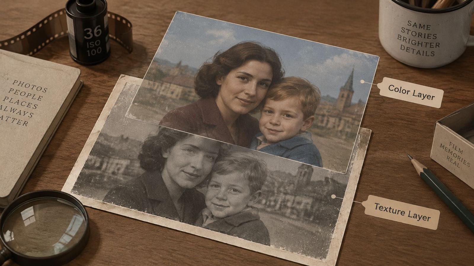
Algorithms infer color from grayscale evidence. They often do a fair job on skies, vegetation, and skin, and they cannot reliably name the original color of an unreferenced dress, vehicle, or wall. Earlier colorization can also reduce the separation between figures and backgrounds that once depended on shadow, texture, and light. That is why a bright, smooth result can feel less like the person than the grey scan did.
Say what the color is
Label every colorized version as an interpretation. The Donner Summit Historical Society newsletter points to institutional practice at the Imperial War Museums: contextual information must make clear that colorized material is an artistic rendition, and a gradual blend between the original and the colored version is preferred to a sudden swap.
Say a dark wool coat in a memorial reel is pushed to bright red. The same coat in a muted grey-blue, with a caption that the hue was inferred, keeps the solemnity and tells the next viewer what you did. The first version rewrites the clothes. The second admits a guess.
Hold saturation down on skin and fabric so faces read as people, not painted surfaces. Grain is also an exposure record, not a filter you sprinkle on at the end. The essay on film grain beyond texture from Department of Vibe is a useful correction if you are tempted to treat grain as decoration. If you need a practical way to keep that character in a digital file, the notes on vintage film texture show how to retain it without burying the face.
Watch this short restoration pass with the original still in mind, then compare what the color adds and what the paper loses.
Mistakes that show up in family reels:
- Invented objects stated as fact: A dress or car color with no reference, captioned as if someone remembered it.
- Over-saturated faces: Cheeks and lips pushed until the person looks illustrated.
- Grain removed to hide scan defects: The defects go, and so does the sense that the picture is old.
Colors added by interpretation, not recovered from the original negative or print. The grayscale frame is the archival image.
Place that line under any shared video. Future viewers can then tell the archive from the rendition without a lecture.
Check Contrast Before You Animate
A figure that reads cleanly in color can vanish the moment you remove hue. That is the failure mode worth catching before any generation credit gets spent. Grayscale collapses an image down to lightness and darkness, so two tones that separated easily as peach wall and gray jacket can land on the same value and fuse into one shape.
High contrast makes an image easier to read for viewers with low vision and for those with color-vision deficiency, and the contrast calculation itself is the part that gets skipped. Test luminance separation directly rather than trusting the grade. A restrained color version, or a carefully remapped grayscale, often reads more clearly than a stylized monochrome treatment you assumed was the safer choice.
Pass conditions before you generate motion
Grayscale round trip. Convert the colored export to grayscale. Pass if the person still separates from the wall, the floor, and other people. Fail if a jacket and a shadow become one shape.
Phone-size view. Look at faces, hands, and clothing at the size most relatives will watch. Pass if eyes, mouth, and hands still read. Fail if features melt into background detail.
Dark clothing against shadow. Pass if the garment edge stays visible. Fail if the body outline vanishes, which gentle animation will only make more obvious.
Squint or slight blur. Soften the image a little. Pass if the subject still reads as a person. Fail if only a blob remains. Edge definition, texture, and a short label can carry information that hue was carrying alone.
File check. Export a clean image at the scan resolution in sRGB. Skip heavy sharpening. Keep the untouched master next to the stylized export. Then convert both the derivative and the master to grayscale and compare histograms. If shadow or highlight percentages have shifted, go back to calibration instead of adding more color. Scanned prints, phone captures, and digitized originals all work here, and the cleaner the source image, the better the motion will hold.
Cleaner images produce better motion. When a test fails, return to the tonal setup. Extra saturation will not rebuild a missing edge.
Keep any movement simple, such as one slow push-in or a gentle drift. Strong camera moves expose tonal problems the still was hiding. Product clips need the same restraint for a different reason: the shape, color, and label have to stay consistent with what the shopper expects to receive, so the motion should never distort the item.
Go if the subject still reads at phone size and separation holds after you remove the color. No-go if a face or a key object dissolves.
Animate One Photo Before You Build the Reel
Do not animate the album. Animate the one still that passed the contrast and file checks. A bad color pass on twenty pictures costs more to undo than a careful pass on one.
Write one short line before you generate anything. Name the motion, the camera move, and the tone. "Slow push-in, slight head turn, quiet and warm" is enough. A paragraph of direction usually fights itself.
One clip, then the reel
Generate a single 5–6 second clip and compare it with the still. Watch the eyes, the mouth, the hands, and any fine pattern on clothing. AI motion is an interpretation, not recovered footage. If a cheek warps or a button crawls, reject the clip and try a calmer line. You are not restoring a film that was never shot.
Review the credit cost before the first generation. A listing-style clip and a memorial hook often need different pacing even when they come from the same source images, so do not assume one successful test predicts the next.
If you want a different kind of move than a simple drift, the Zemith walkthrough on how to animate images with parallax effects shows what layered depth can and cannot do. For the exact upload, prompt, and download path we use, follow the step by step tutorial.
Download the MP4 and cut the reel in this order.
- Open on the grayscale original so viewers see the archival frame first.
- Reveal the colored clip so the interpretation arrives as a change, not as a replacement.
- Pace the edit to the clip length. A five or six second move does not need a fast cut. Add music or a short narration only if the occasion calls for it, then export.
Uploads and generations auto-delete after 7 days. Save the finished clip to your own drive, and keep the master scan somewhere that is not the generation folder.
Pick one photo from the family archive this week. Run the scan, the color pass, and the phone-size check. Animate that single frame before you commit the rest of the album.
Photo for Video turns one finished still into a 5–6 second clip with gentle motion, meant for birthdays, memorials, and other family keepsakes. Color and label the photograph first, then let the movement carry a picture you have already checked. When that one frame is ready, visit Photo for Video and make the clip before you build the full reel.