Master Vintage Film Texture: Guide for Photos & Video
Create authentic vintage film texture for photos & videos. Learn grain, color, light leaks, & era-specific recipes for a perfect retro look in our 2026 guide.
You're probably staring at one of two things right now. A clean digital photo that feels too perfect to carry memory, or an old family scan that already has character, but loses that character the second you start editing it for a reel, tribute, or anniversary montage.
That gap is where most vintage looks fail. People add a preset, slap on a dust overlay, and end up with something that reads as “edited” instead of “lived in.” Vintage film texture works when it feels embedded in the image, not pasted on top of it. The difference comes from understanding what film texture is, how different eras handled contrast and grain, and how to keep those qualities intact once a still image turns into motion.
Table of Contents
- More Than Just a Filter The Soul of Vintage Texture
- The Anatomy of Authentic Vintage Film
- Your Digital Darkroom Crafting the Base Texture
- Quick Recipes for Classic Film Eras
- From Still to Motion Preserving Texture in Animated Photos
- Exporting and Sharing Your Vintage Creations
More Than Just a Filter The Soul of Vintage Texture
A lot of people first reach for vintage texture when they find an old photo of a parent, grandparent, or a childhood moment and want the edit to feel like the memory itself. The problem is that clean digital tools are very good at removing the very things that made film feel human. Sharp edges, strong local contrast, and modern saturation can make a treasured image look recent, even if the subject is decades old.
That's why the best vintage treatment starts with restraint. You're not trying to make an image look damaged. You're trying to make it feel handled, printed, projected, and remembered. A soft grain bed, slightly lifted blacks, and a controlled fade in the highlights can do more emotional work than a dozen gimmicks.
When I'm building this kind of look for family edits, I think less about “retro style” and more about evidence of age. Film stock had a physical surface. Lenses bloomed in certain conditions. Prints faded unevenly. Dust showed up because the object existed in the world. That history is what people respond to.
Vintage texture works when the imperfections support the memory instead of competing with it.
If you're starting from a clean image and want a broader old-photo foundation first, this guide on how to make a picture look old is a useful companion. The key is to treat texture as part of storytelling, not as a novelty effect.
A good vintage look also respects the subject. Memorial tributes often need quiet softness. Birthday reels can carry more color and flicker. Anniversary montages often sit somewhere in between. The craft is in matching the texture to the emotional weight of the image.
The Anatomy of Authentic Vintage Film
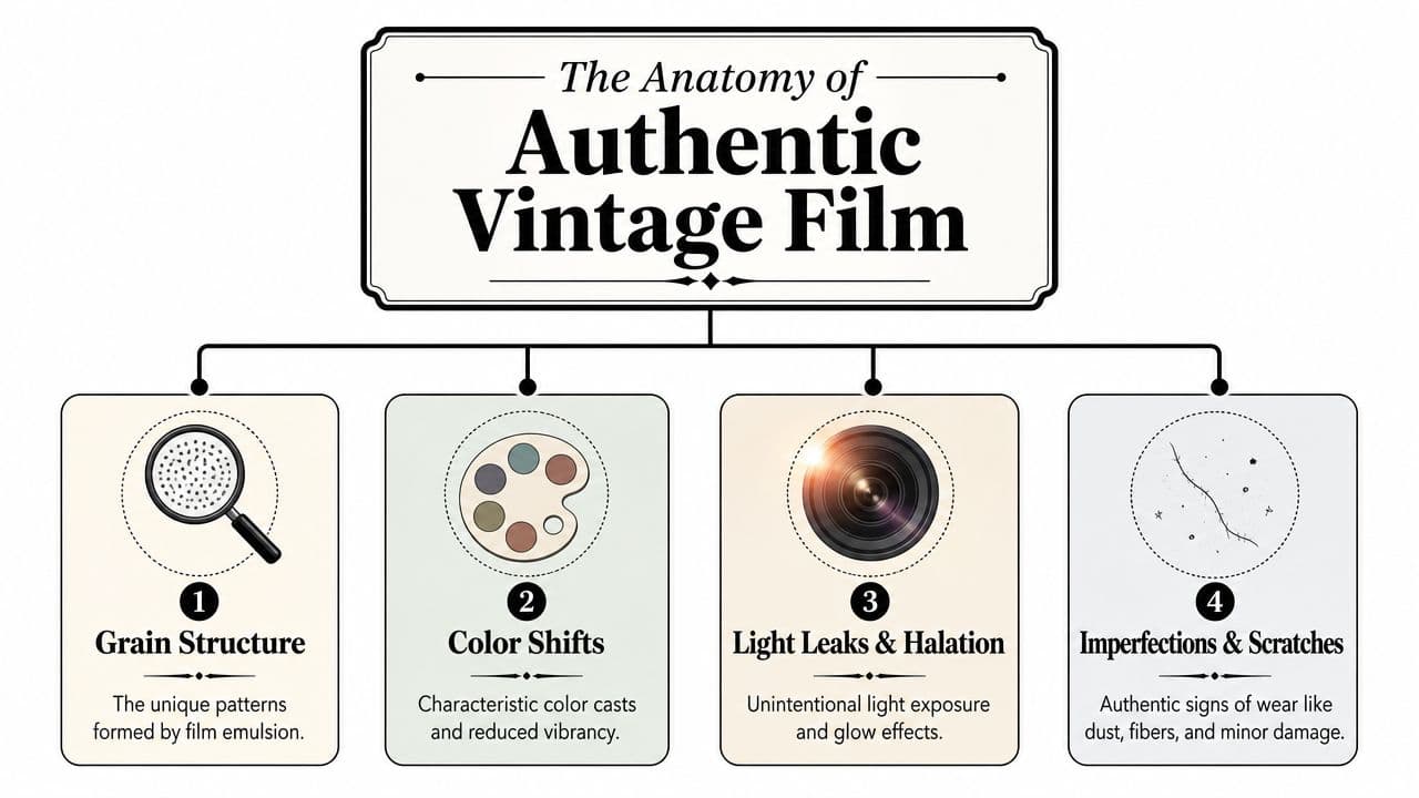
Authentic vintage film texture isn't one effect. It's a stack of visual behaviors that work together. If one layer is too strong or too clean, the illusion breaks.
Why texture feels emotional
Film texture has emotional power because it introduces variation. Digital images tend to describe the world with consistency. Film often describes it with instability. Grain shifts. Color drifts. Highlights bloom. Edges darken. Tiny flaws remind the viewer that the image came through a material process.
That instability creates mood. It can make a portrait feel tender, a vista feel historical, or a home-video-style clip feel intimate. The trick is to know which ingredients create that response.
The four pillars
Grain structure is the first thing most editors notice, but it isn't just noise. Good grain has size, density, and character. If it's too fine, it reads as compression. If it's too big, it looks like a filter. Monochrome grain usually feels more photographic than colorful digital speckling, especially in skin tones and skies.
Color shifts do just as much work as grain. Vintage images usually don't carry the crisp, high-separation color that modern cameras produce. Muted palettes, slightly softened contrast, and a gentle lift in the blacks help an image stop looking freshly captured. Faded shadows often feel more convincing than lowering saturation across the board.
Imperfections and wear give the frame history. Dust, faint scratches, fibers, and subtle print contamination all suggest handling and age. But these should be sparse. A heavy overlay repeated across every shot starts to feel like stock footage instead of a believable artifact.
Practical rule: If viewers notice the scratch before they notice the face, the overlay is too strong.
Optical artifacts round out the illusion. Vignetting, halation-like glow around brighter areas, slight flicker, and occasional gate-weave style movement can make a frame feel projected or duplicated from older media. These effects are powerful because they alter the way light behaves, not just the surface of the image.
A useful way to think about the whole stack is this:
- Grain sets the surface
- Color sets the era
- Imperfections set the age
- Optical artifacts set the medium
Most weak edits overuse only one of these. Most convincing edits distribute the work across all four. That balance is what gives vintage film texture depth.
Your Digital Darkroom Crafting the Base Texture
A tribute reel often starts with a clean phone photo, a family scan, or a restored portrait that still feels too current. The fix is not one grain slider. The base texture has to be built in layers, in the right order, so the final image holds up both as a still and once it starts moving.

Start with tone before grain
The first pass is tonal cleanup. In Lightroom, Camera Raw, or Resolve, I usually pull back Clarity, trim Vibrance, and reduce overall contrast before I touch grain. Then I lift the black point slightly on the RGB curve, ease down highlights, and open shadows just enough to remove the hard digital snap that modern files carry.
That black lift does two jobs. It suggests print age, duplication, or mild fade, and it gives the texture room to sit inside the image instead of floating on top of it. Crushed shadows swallow grain. Slightly raised shadows let the texture read as part of the emulsion.
Skin is the checkpoint. If a face starts looking chalky, gray, or over-soft, the grade is already drifting off course. Leave some density in the midtones. Vintage images rarely feel convincing when every dark area is washed out.
Be careful with cleanup at this stage. Global sharpening can make pores, hair edges, and dust all compete at once, which breaks the illusion fast. If a scan needs help, use restrained, selective detail recovery first. This guide on how to sharpen an image without making edges brittle is a good reference before you start aging the file.
Dial grain so it belongs
Once the tonal shape feels right, set the grain to match the source. Resolution matters. Subject matter matters. A close-up portrait, a low-resolution family snapshot, and a scanned outdoor photograph should not get the same texture settings.
For a balanced starting point, set grain amount around 35 to 45, size around 40 to 60, and roughness around 70 to 80. I stay near the lower end for faces and push size upward for wide scenes or flatter backgrounds where grain needs more presence to survive export. If roughness gets too high while size stays too tight, the result starts reading as digital noise instead of film texture.
A few trade-offs show up every time:
- Fine grain on a compressed file often disappears once the reel is exported for social.
- Large grain on skin can add age in the wrong way.
- High amount with low roughness can look pasted on.
- Visible grain in empty skies or walls needs extra restraint because viewers notice repetition there first.
Zoom out often. Grain that looks perfect at 200 percent can feel detached at fit-to-screen, which is the only view viewers will typically see.
If the project is headed for motion, I also test grain while panning or slowly pushing into the photo. Static texture can feel acceptable on a still frame and then fall apart once the image starts animating. The texture should hold together during movement, not shimmer like compression noise.
Layer wear without making it fake
Wear comes last, and only after the base image already feels older. Dust, scratches, and leaks work best as finishing cues, not as the main event. Keep each one on its own layer or node so opacity stays easy to control.
My stack usually looks like this:
- Base grade with softer contrast and a lifted black floor
- Grain pass tuned to the file size and subject
- Dust or fiber layer kept subtle and irregular
- Optical aging such as vignette, mild bloom, or a restrained leak if the shot benefits from it
Portraits need extra discipline. Keep heavy dust away from eyes and mouths. In memorial edits and family tributes, those are the areas carrying the emotion, and texture should support that, not interrupt it.
Variation also matters. If every photo in a montage shares the same scratch, same leak, and same dust map, the edit starts feeling templated. Real archives are inconsistent. A good vintage workflow keeps that inconsistency on purpose.
Quick Recipes for Classic Film Eras
Different decades ask for different decisions. The easiest way to miss the mark is to use one all-purpose vintage preset for everything. A black-and-white portrait, a pastel family snapshot, and a gritty sunlit memory shouldn't share the same grain and color logic.
Vintage Era Quick-Start Guide
| Era | Color Palette | Grain Style | Key Effects |
|---|---|---|---|
| 1930s Black and White | Deep monochrome with controlled highlights and soft shadow rolloff | Fine to moderate, mostly subtle, never crunchy | Strong tonal separation, slight vignette, restrained flicker |
| 1950s Color | Soft, gentle, slightly faded color with reduced vibrance | Finer grain, low intensity | Matte blacks, delicate warmth or mild cyan balance, light bloom |
| 1970s Cinema | Warm, earthy, sun-baked color with less polish | Larger, more visible grain with rougher texture | Heavier vignette, lower clarity, stronger fade, occasional leak or weave |
How to choose the right era
1930s black and white works best when the subject has shape and contrast built into it already. Formal portraits, architecture, and documentary-style family images respond well to this treatment. Keep the frame disciplined. The mood comes from tonal design, not from piling on scratches.
1950s color suits anniversaries, weddings, and gentler family pieces. This look benefits from cleaner composition and more flattering skin. Keep grain present but understated. The image should feel printed, not distressed.
1970s cinema is a good choice for travel images, outdoor childhood scenes, and montage segments that need a warmer, more lived-in energy. Let the texture be more visible; roughness and larger grain can add character instead of distraction.
A simple decision filter helps:
- Choose 1930s if form and drama matter more than warmth.
- Choose 1950s if you want tenderness and polish.
- Choose 1970s if you want memory to feel tactile and sun-worn.
The era should support the subject. Don't force a gritty 1970s treatment onto a delicate bridal portrait unless the story calls for it.
From Still to Motion Preserving Texture in Animated Photos
Animating a still photo introduces a problem many editors don't anticipate. Motion changes how texture is perceived. Grain that looked beautiful on a static frame can shimmer, clump, or flatten once the image starts moving.

Two workflows that hold up
The first workflow is to finish the still image before animation. Grade the photo, add the vintage film texture, and export a high-quality still. Then animate that prepared image. This keeps grain, tone, and wear locked to the original frame. It's the most reliable option when the photograph itself is the artifact you want to preserve.
The second workflow is to animate the clean photo first, then add motion-specific texture after export. This works better when you want moving flicker, gate weave, or time-based grain behavior. It gives you more control over how the texture behaves across frames, especially in tribute edits where movement is subtle and slow.
The biggest mistake is mixing both workflows too aggressively. If the still already contains heavy grain and then you add another moving grain layer on top, the result can turn muddy fast. One layer should own the surface. The other should only add motion character.
What motion does to grain
In After Effects, a useful practice is to apply Add Grain to an adjustment layer and set Viewing Mode to Final Output so you judge the result in context, not in a misleading preview mode. For a more vintage cadence, you can also reduce footage to 18 or 24 fps using Interpret Footage or Posterize Time, as described in this After Effects vintage film workflow from Enchanted Media.
Those frame-rate choices affect texture perception as much as motion style. Lower cadence can make the image feel more period-correct, but it also makes flicker and grain more noticeable. That's good when the treatment is subtle. It's a problem when the treatment is already heavy.
If you're animating an old scan that needs restoration first, upscaling low-resolution photos before motion can help preserve facial detail under grain. The order matters. Recover structure first. Add age second. Animate last, or add time-based effects after animation, but not both at full strength.
For tributes and memorial reels, I usually favor the first workflow. Lock the emotional look into the still, then keep motion gentle. The audience should feel memory moving, not software showing off.
Exporting and Sharing Your Vintage Creations
Export is where a lot of careful texture work gets wrecked. Film grain is fragile under compression. If you choose aggressive settings, the image can smear in the shadows, break into blocks in the mids, or turn the grain into ugly digital chatter.
Protect the grain on export
The practical solution is simple. Export a master first, review it on the biggest screen you have, and only then make social versions. Don't judge grain from a tiny preview window. Compression problems often hide until the file is uploaded or viewed on a television.
A few habits help:
- Keep a clean master so you can create different delivery versions without rebuilding the grade.
- Check dark areas first because grain usually falls apart there before it fails anywhere else.
- Avoid oversharpening before export since sharpened grain becomes brittle and noisy.
- Test one short segment before rendering a full tribute or reel.
Compression doesn't remove bad texture choices. It exaggerates them.
Good uses for this look
Vintage film texture shines when the content already carries memory. Memorial slideshows, birthday reels made from childhood scans, anniversary montages, family-history projects, and heritage brand storytelling all benefit from texture that feels rooted instead of decorative.
It also works well in moderation for social clips. A light vintage pass can help a reel stand out because it breaks away from the clean sameness of most mobile footage. The key is not to overstate it. On fast platforms, viewers respond better to a coherent mood than to an effect screaming for attention.
The strongest export is the one that still feels personal after it leaves your timeline. If the grain holds, the contrast stays soft, and the image still feels like a memory instead of a preset, you've done the job right.
If you want to turn a treasured still into a short moving memory without losing its analog character, Photo for Video is built for that use case. You can start with an old scan, a phone capture, or a restored family picture, describe the motion you want, and generate a polished clip that keeps the original mood intact for tributes, anniversaries, birthdays, and keepsake reels.