Color to Black and White: Methods That Keep Detail
Learn how to convert color to black and white in Photoshop, Lightroom, phone apps and online tools, and keep contrast for video.
You've scanned a family photo, and the people are clear, but the original colors feel out of place in a tribute or archival montage. A one-click filter makes it black and white, yet the red sweater and green leaves behind it collapse into nearly the same gray. The fix isn't to avoid monochrome. It's to choose how the colors map to gray, check that important details still separate, and keep the color scan untouched.
Black and white works best as an output version, not a replacement for your source image. Match the conversion method to the photo, adjust tones with the subjects in mind, and save a separate copy for sharing, printing, or animation.
Table of Contents
- Pick the Right Black and White Method
- Keep the Color Master and Convert a Copy
- How to Convert in Photoshop and Lightroom
- Phone Apps and Online Tools Compared
- Keep Contrast and Separate Subjects in Gray
- Prepare Old Photos for Animation
- Common Mistakes and How to Fix Them
Pick the Right Black and White Method
No single conversion method wins for every photo. Choose based on what needs to stay distinct in the frame and which editing tool you have open.
| Method | Best for | Tonal control | Where to find it | Main risk |
|---|---|---|---|---|
| Desaturation | Quick previews and flat graphics | Low | Photoshop Image > Adjustments > Desaturate | Red and green can merge into the same gray |
| Black & White adjustment layer | Most portraits and landscapes | High, six color sliders | Photoshop Layer > New Adjustment Layer > Black & White | Overdone sliders make skin look harsh |
| Channel Mixer (Monochrome) | Fine control of skin, sky, and foliage | High, per-channel percentages | Photoshop Layer > New Adjustment Layer > Channel Mixer | Channel totals above 100% can clip highlights |
| Curves | Contrast and midtone shaping after conversion | High, tonal | Photoshop Layer > New Adjustment Layer > Curves | Steep S-curves crush shadows |
| B&W panel with color sliders | Batch work and RAW files | High, eight color sliders | Lightroom Develop > Basic > B&W | Heavy hue shifts when sliders are pushed hard |
| Presets and phone filters | Fast family snapshots | Low to medium | Lightroom presets, phone photo editors | Presets ignore your photo's exposure |
Desaturation is handy for a quick preview, but it doesn't give you a way to make a red shirt lighter than green foliage if both land on similar gray values. The Black & White adjustment layer offers a practical balance of control and simplicity. Channel Mixer provides more direct control over the contribution of each color channel, but watch the combined percentages: push them too high and bright areas can lose detail.
Curves shapes contrast after the conversion. It can add depth to a flat image, but it can't selectively distinguish a red object from green surroundings on its own. Lightroom's B&W panel is useful for RAW work because its color sliders let you adjust how different hues translate to gray while keeping the color data available for later edits.
Monochrome also carries a history that matters when you're working with old family pictures. The Smithsonian Institution's account of color photography notes that most photographs were black and white for more than half of photography's history, and that color wasn't widely embraced in art photography until well into the 1970s. Grayscale can therefore preserve the visual character associated with many archival images, rather than acting as a decorative filter.
If you're calibrating a display before judging subtle tones, this guide to image color calibration can help you get a more dependable preview. For the conversion itself, use a simple rule: when colors you need to separate have similar brightness, skip plain desaturation and start with the Black & White layer or Channel Mixer.
Keep the Color Master and Convert a Copy
Keep the color scan as your master. Make the black-and-white file a separate, non-destructive derivative, even if you're sure the monochrome version is the one you'll use today.
That rule matters most for faded or damaged photographs. Color carries detail a grayscale conversion throws away: stains, emulsion damage, skin tones, and subtle background information that can still be recovered during retouching. A damaged or faded original also deserves a higher-bit-depth capture than a clean continuous-tone print, because the extra tonal information gives you more to work with when the scan itself is weak.
Treat the conversion as an output version, not the photo itself. Retain the original scan, build the monochrome look on top of it, and save a layered working file alongside each flattened export. If you save over the scan or flatten your only copy, the color clues are gone and every future version is locked to today's decisions.
For a print, convert the finished grayscale file back to RGB before sending it out. Canon recommends this step so the printer can interpret the full range of subtle tones. And store the physical original carefully: direct sunlight and ultraviolet exposure fade photographic images over time.
When you're ready, convert a copy, check that subjects still separate in gray and that contrast holds up, then export. If the finished image is headed for a video, include one concise direction for the motion and tone along with the file.
How to Convert in Photoshop and Lightroom
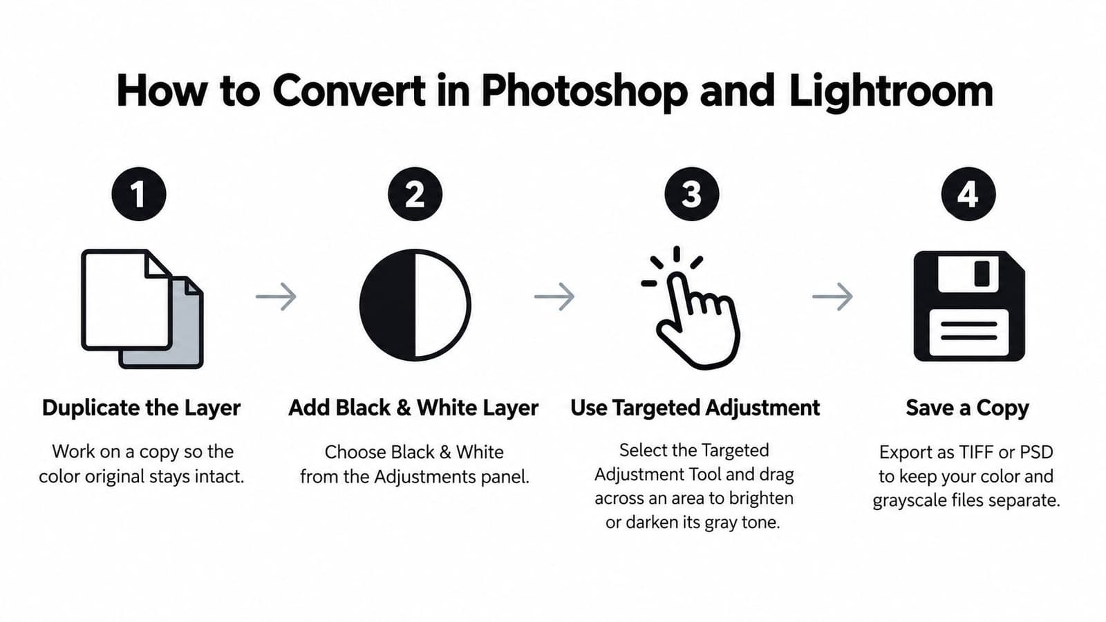
Use a targeted adjustment rather than treating the whole frame as one tone. In a portrait, for example, you might want to brighten a face without washing out a light shirt or lifting the background.
Photoshop workflow
-
Duplicate the layer or open a copy. Keep the color original intact so you can compare versions and start again without damaging your source.
-
Add a Black & White adjustment layer. Choose it from the Adjustments panel rather than flattening the image into grayscale. The layer gives you separate controls for the color families that make up the photo.
-
Use the Targeted Adjustment tool. Select it, then drag over a face or sky to change the gray value of the colors beneath your cursor. This is faster than guessing which slider affects a particular area.
-
Add a Channel Mixer layer if hues still merge. Select Monochrome, then adjust the red, green, and blue channel contributions to separate subjects with similar brightness. Keep an eye on bright areas while you tune the mix.
-
Shape contrast with Curves. Add a gentle S-curve for more separation, and lift shadows slightly if dark hair or clothing starts to merge into one mass. Curves refine tonal contrast; they don't replace careful color-channel mapping.
-
Export a flattened copy and retain the layered file. The flattened image is convenient for sharing, while the layered version preserves your adjustments for later changes.
Lightroom workflow
-
Open the image in Develop and switch to B&W. Use the B&W option in the Basic panel or apply a B&W profile. This creates a monochrome starting point while leaving the original color information available in the editing workflow.
-
Adjust the eight color sliders. Work with red, orange, yellow, green, aqua, blue, purple, and magenta to control how each hue appears in gray. Move one slider at a time so you can tell which tones are changing.
-
Use Targeted Adjustment on the subject. Drag over the face, clothing, or background area that needs more separation. Judge the change in context, not just by whether one object becomes lighter.
-
Shape the contrast with the Tone Curve. Make restrained changes to lift or deepen midtones while keeping important highlights and shadows detailed. A dramatic curve can make a small preview look punchy but can hide detail in the full image.
-
Export an sRGB JPEG for sharing. Keep the original and working edit separate, then inspect the exported file at the size people will view it.
The final check is straightforward: the sliders should separate faces from the background, not merely brighten the entire frame.
Phone Apps and Online Tools Compared
For quick family pictures, a phone editor may be all you need. For a faded scan or a portrait where the subject blends into the setting, choose an app with more control over the tones.
| Tool | Where to find the option | Control | Cost | Best for |
|---|---|---|---|---|
| iPhone Photos | Edit > Filters > Mono, Silver, or Noir | Low, intensity slider | Free | Quick family snapshots |
| Google Photos | Edit > Filters > B&W, then the Adjust tab | Medium, light and contrast | Free | Batch work across a library |
| Snapseed | Tools > Black & White | Medium, tone and color sliders | Free | Precise tone on a single image |
| Lightroom Mobile | Edit > Color > B&W, with eight color sliders | High | Free tier, paid plan for full features | Family photos that need precise tones |
| Photopea | Image > Adjustments > Black & White | High, same logic as Photoshop | Free with ads, paid option | Editing in a browser without installing |
| Online converters | Upload, then choose grayscale | Low, one-click | Free, varies by site | One-off files that aren't sensitive |
Whatever tool you use, work in the same order: duplicate the photo, correct exposure, adjust the monochrome tones, then export at the highest quality available. Repeatedly saving a compressed image can make fine detail harder to recover.
Online converters are convenient, but they require you to upload the image to a server. Check the site's deletion policy before sending family photos, and use an offline app for sensitive material. If the scan is faded, do exposure and dust repair on a desktop first, where you have more room to recover detail from shadows.
Test the result at phone size, since that's where many relatives will view it. If you're also considering the reverse edit, this photo recoloring guide from Magic Genie offers a useful look at adding color to a monochrome image.
Keep Contrast and Separate Subjects in Gray
Grayscale conversion collapses color into brightness, so two hues that look clearly different in the original can land on the same gray. Under BT.709 luminance weighting, red contributes about 21% of the gray value, green about 72%, and blue about 7%. That imbalance explains why green foliage can render brighter than skin, and why a red shirt surrounded by leaves often flattens into one tone unless you remap the channels.
The test is simple. Shrink a grayscale preview to thumbnail size or blur it slightly, then look for the edges that matter: face against background, collar against neck, subject against sky. If any of them disappear at that scale, the conversion is failing to separate your subjects, however good it looks full size.
| Subject | Symptom | Adjustment |
|---|---|---|
| Portrait skin | Face flat against the background | Raise red by 5–10 points |
| Blue sky and clouds | Sky and clouds merge | Raise blue, lower green |
| Red clothing with green foliage | Shirt and leaves turn the same gray | Raise red, lower green |
| Faded scan with yellow cast | Muddy midtones, low contrast | Add an S-curve and lift blacks slightly |
Treat these as starting points you adjust per image. Channels interact, so if raising red brightens a shirt but makes the face harsh, ease off and try lowering green instead, or mask the face on the working copy. Several small moves of 5–10 points usually separate tones more cleanly than one large pull.
Because the monochrome version is graded against the color original, you can push these adjustments hard and compare freely before committing. When you need to judge whether fine edges hold up, these image-sharpening techniques help you read detail that color contrast used to carry for free.
Prepare Old Photos for Animation
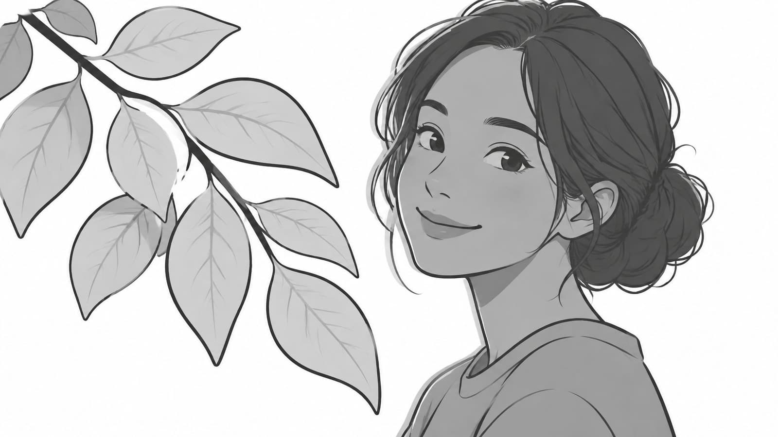
Monochrome often fits an old family photograph because it matches the look of many images from the period. The Library of Congress account of the Farm Security Administration and Office of War Information collection describes an extensive record of American life from 1935 through 1944, including more than 170,000 black-and-white photographs compared with approximately 1,600 color prints.
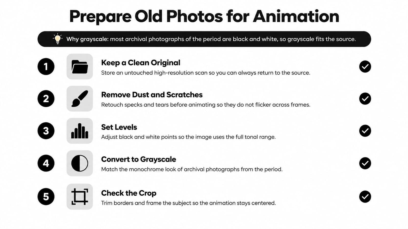
Use this sequence to prepare a scan for gentle movement:
- Keep the color scan as the master. This keeps your monochrome edit reversible and protects details that may not survive conversion.
- Remove dust and scratches. Specks and scratches can flicker across frames once the image moves.
- Denoise lightly, then add grain only after tonal correction. Grain that looks subtle in a still may shimmer during animation, so avoid heavy reduction that wipes out facial texture.
- Set the black point near 5–10 and the white point near 240–245 on a 0–255 scale. These starting points leave room at each end of the tonal range and reduce the chance of clipping.
- Check eyes, hairline, and collars. These edges help the face and clothing remain legible against their surroundings.
- Crop for the final frame. Use 16:9 for a wide tribute or 9:16 for a reel, and keep the subject positioned for the intended movement.
- Export a high-quality sRGB JPEG or PNG. A clean export avoids unnecessary compression before animation.
- Upload the image with a concise motion direction. Describe the camera move and tone, and choose restrained movement, such as a slow push-in or a soft blink, so the clip feels connected to the still.
If you want a broader overview of turning a still into a moving clip, this guide to creating videos from static images lays out the process. For older scans with more visible wear, use this old-photo enhancement guide to plan restoration before animation.
Common Mistakes and How to Fix Them
Most failed monochrome edits come from skipping a contrast check or pushing one adjustment too far. The symptoms point to different causes, so don't try to fix every problem by increasing contrast.
| Symptom | Likely cause | Fix |
|---|---|---|
| Gray, muddy midtones | Desaturating a flat scan with no contrast pass | Add an S-curve and tune the Black & White sliders |
| Chalky, bright highlights | Channel Mixer total above 100% | Lower the combined channel percentages until highlights regain detail |
| Shadows turn solid black | Steep curve pushing the black point too low | Lift the black point a few points and recheck hair and dark clothing |
| Stripes across smooth skies | Heavy edits on an 8-bit file | Edit in 16-bit when available and add light grain |
| Grain shimmers after animating | Noise amplified by motion | Denoise and remove dust before upload |
| Original is gone | Flattened file saved over the scan | Keep the color master and use adjustment layers |
Dust, noise, and preserving the original all need attention before export. For the finished conversion, use a few quick checks:
- Toggle before and after. Make sure the edit improves the image rather than only making it look more dramatic.
- Check the histogram at both ends. Clipping can remove detail from highlights or shadows.
- View it on a phone. That small-screen check reveals when faces or clothing stop separating clearly.
Photo for Video turns a single still image into a short video with gentle movement for family tributes, birthdays, and keepsakes. Once your black-and-white copy is ready, add a brief direction for the camera move and tone, then visit Photo for Video to turn the photo into a polished clip.