Drawing on Photos App: Pro Tips & Tricks for 2026
Master your drawing on photos app. Discover mobile & desktop tools, quality tips, & animation techniques. Go beyond markup in 2026!
You've probably got a photo open right now that matters more than the average camera roll image. It might be a scan of your grandparents on their wedding day, a slightly blurry birthday snapshot, or a portrait you want to turn into something more personal than a filter. You want to add a handwritten date, a traced outline, maybe a small symbol or note. You also don't want to flatten the feeling out of the image.
That's the key challenge with a drawing on photos app. The technical part is easy to find. The tasteful part isn't. Most guides stop at stickers, memes, or quick markup. Family keepsakes need a different mindset. You're not decorating a disposable image. You're editing memory.
Table of Contents
- Drawing on Photos for More Than Just Markup
- Choosing Your Drawing Tool
- Core Techniques for Meaningful Annotation
- How to Preserve Image Quality and Likeness
- Exporting for Animation with Photo for Video
- Common Questions and Troubleshooting
Drawing on Photos for More Than Just Markup
The best edits don't shout. They clarify.
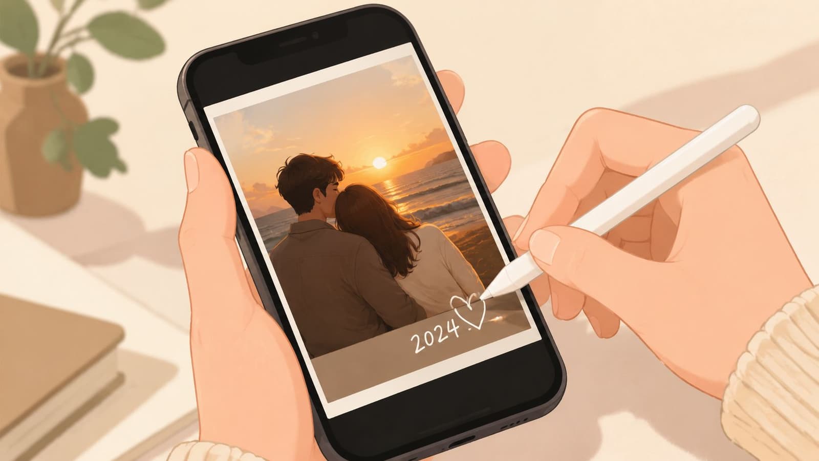
A tiny drawn circle around the corsage in a wedding portrait can pull attention to a detail the family still talks about. A lightly traced house outline over an old driveway photo can turn a plain scan into a keepsake about place. A handwritten note in the corner can give context that the image never carried on its own. That's where a drawing on photos app earns its place.
When I work with family archives, I treat annotation like restoration, not decoration. The mark should help the viewer feel the story faster. If the added line becomes the main event, it's usually too much. Old photos already carry texture, age, and mood. Your job is to support that, not overwrite it.
Small additions can change the meaning
Some of the strongest uses are modest:
- Dates and places: A handwritten year or location can anchor a floating family memory.
- Connection lines: A subtle arrow or circle can identify a person younger relatives don't recognize.
- Symbolic marks: A heart, flower, stitched border, or traced object can add warmth without turning the photo into clip art.
Those choices feel simple, but they solve a real problem. Many family photos are emotionally rich and visually ambiguous. Annotation helps the image speak.
A meaningful mark should answer a question the photo can't answer by itself.
The tools have also matured enough to support this kind of work. Apple's App Store listing for You Doodle on the App Store shows how far the category has moved beyond basic markup. The app includes drawing, text, shapes, layers, stickers, collage, and export to video or GIF. It also works in iMessage and the Photos app and supports Apple Pencil. That mix tells you something important. Drawing-on-photo tools aren't just novelty apps anymore. They're part of normal mobile creative workflow.
Why this matters for keepsakes
If you're making something for a birthday slideshow, memorial board, anniversary gift, or printed scrapbook page, the point isn't to show off editing skill. The point is to preserve feeling.
A good drawing on photos app lets you do that gently. It gives you room to add personality while leaving the original memory intact.
Choosing Your Drawing Tool
Not every photo needs a full art app. Some do.
The wrong tool creates two problems at once. It slows you down, and it tempts you into destructive edits because the app wasn't built for layered, reversible work. The right tool depends less on brand loyalty and more on the job in front of you.
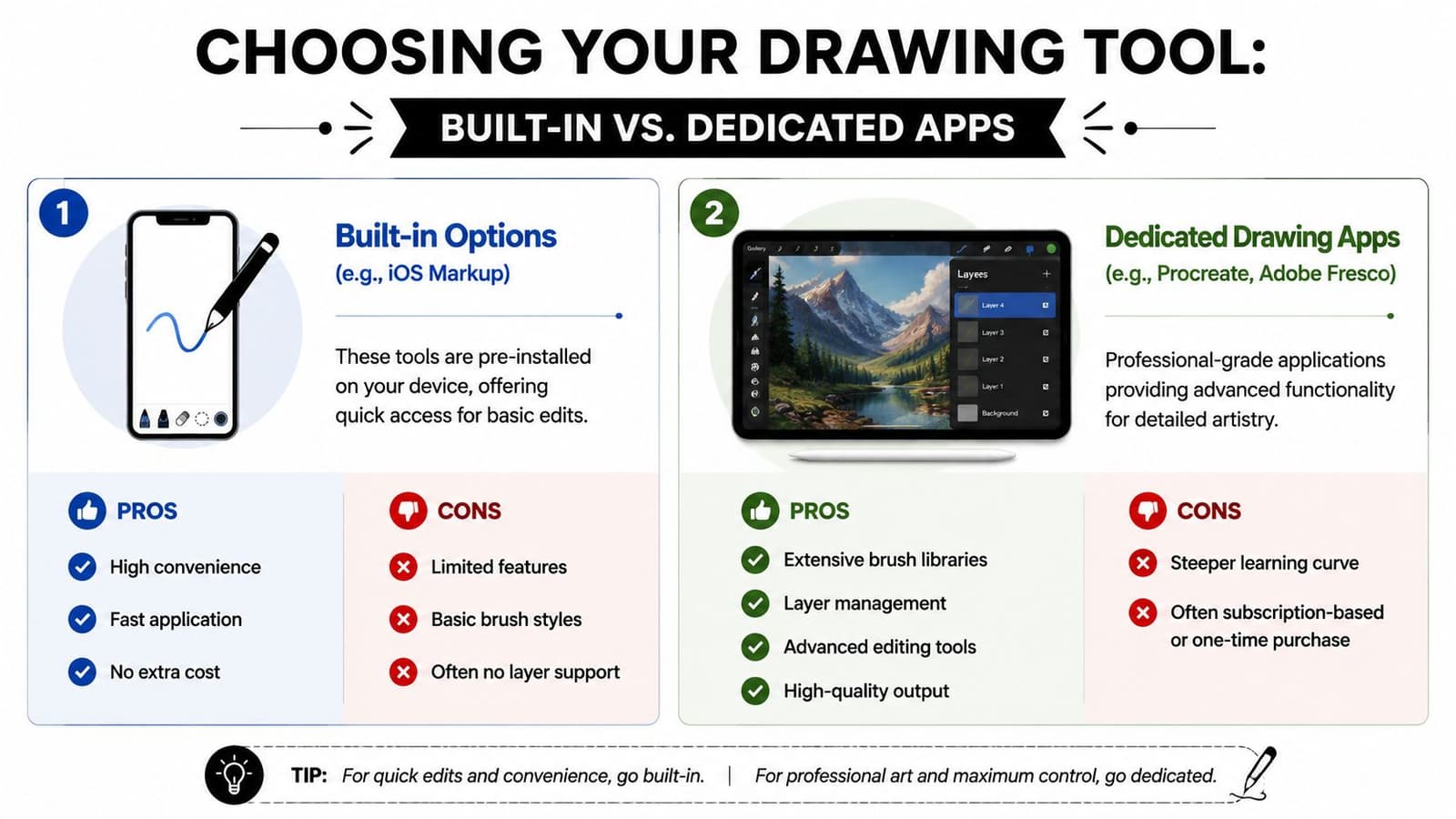
Built-in tools when speed matters
Built-in editors are useful when the goal is immediate clarity. If you're labeling faces for a family group chat, circling a detail, or adding one quick handwritten note, the phone's native markup tools are often enough.
They work well for:
- Fast notes: Date, name, place, or a simple arrow.
- One-pass edits: Small changes you won't need to revise later.
- Low-friction sharing: Sending a marked image back through Messages or saving it straight to Photos.
Their weakness is control. You usually get basic brushes, limited texture options, and little or no real layer management. That becomes a problem the moment you want subtle opacity, cleaner masking, or the ability to test a look and undo only one part of it.
Dedicated apps when the photo deserves more care
Dedicated apps are better when you're building an actual composition. That includes tribute slides, scrapbook pages, portrait overlays, traced line work, or artwork you may want to animate later.
The category is much more capable than people assume. According to an iPhone Photography School review of apps that turn photos into drawings, some apps now offer over 2,000 filters and 90+ drawing styles in Painnt, while Prisma includes over 300 styles in its paid tier. The same review notes support for image sizes up to 4,096 pixels and controls such as line thickness, density, stroke length, and vignette. That tells you these tools are no longer just playful filter machines. They support more deliberate, high-resolution creative work.
If you're comparing apps, look past the home screen. Ask whether the app gives you room to be careful.
| Need | Built-in tool | Dedicated app |
|---|---|---|
| Quick label or arrow | Strong fit | Also works |
| Non-destructive layers | Usually weak | Much better |
| Brush texture control | Limited | Strong |
| Portrait refinement | Basic | Better for subtle edits |
| Print or animation prep | Risky | Safer |
If your goal leans stylized, it can also help to study a few free ways to turn a picture into a sketch before you choose an app. That gives you a better sense of whether you need a filter-first workflow or a hand-drawn one.
What to check before you commit
A good decision usually comes down to four checks:
- Layer support: If the app can't isolate your drawing from the original photo, skip it for sentimental images.
- Opacity control: Strong marks are easy. Gentle marks need control.
- Brush character: You want pencils, pens, chalks, or ink that match the mood of the photo.
- Export quality: If the image may be printed, archived, or repurposed, low-quality output will show.
Practical rule: Use built-in tools for communication. Use dedicated apps for keepsakes.
Core Techniques for Meaningful Annotation
Technique matters less than intent. Start by deciding what the drawing should do for the image. Should it guide attention, reveal form, add context, or create a bridge to a later animation?
Minimal outlines that support the photo
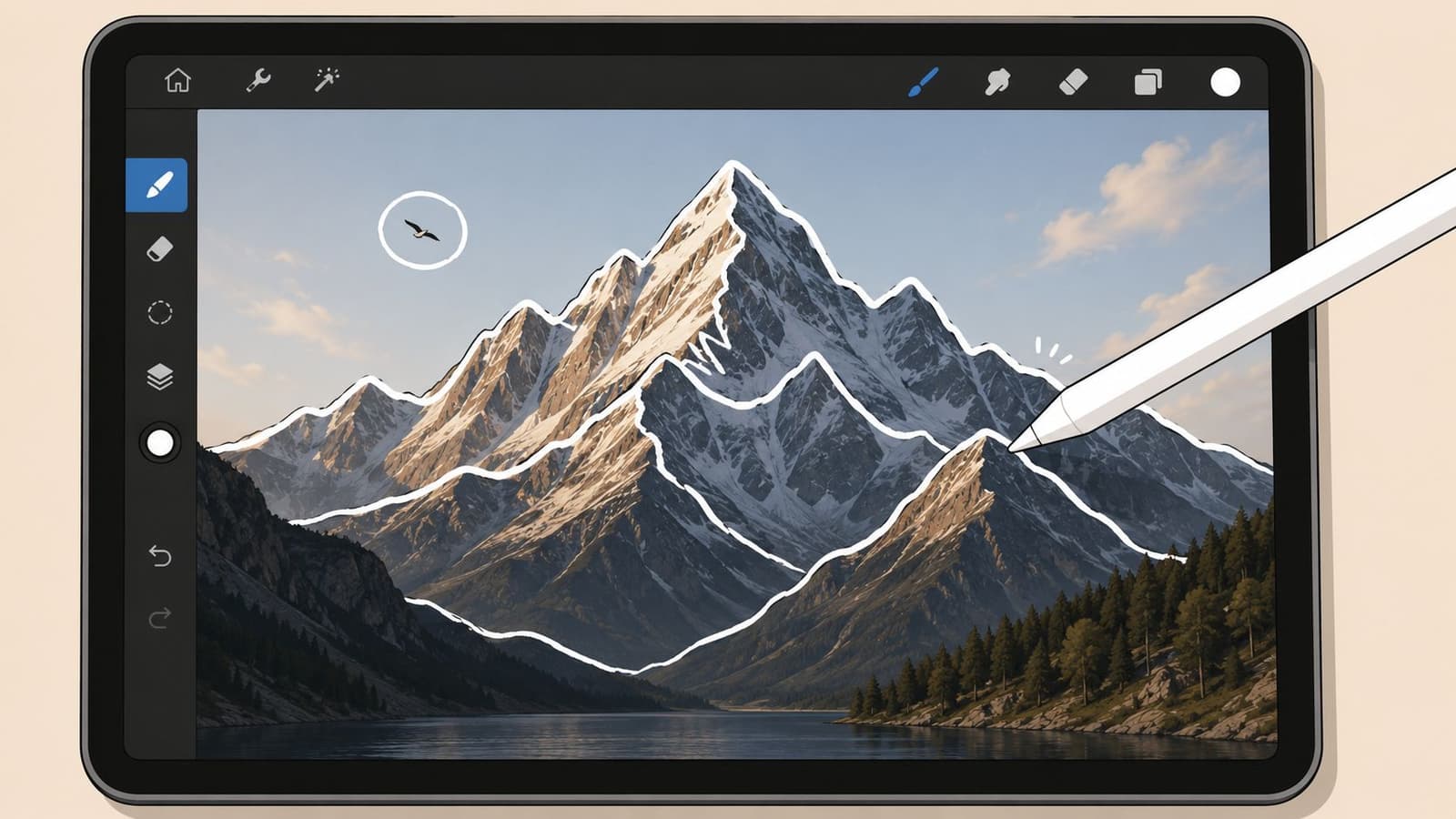
A traced outline works best when the subject has a clear silhouette: a couple at sunset, a child with a balloon, a house roofline, a bouquet, a pet profile. Don't outline everything. Choose one form.
The reason is simple. A selective outline tells the eye where to look. A full tracing often feels stiff and crowded, especially on old scans with natural grain.
Try this workflow:
- Lower the visual weight: Use a fine brush and moderate opacity so the line sits with the photo instead of on top of it.
- Trace only anchor edges: Jawline, shoulder, hat brim, window frame, bouquet edge. Leave internal clutter alone.
- Stop before completion: An open contour often feels more elegant than a closed one.
This is one of the cleanest ways to add style without losing documentary value.
Handwritten text that feels native to the image
Text works when it behaves like a marginal note, not a headline. Family photos rarely need bold typography floating over faces. They usually need a whisper.
Good handwritten additions include:
- names
- dates
- a short memory
- a place
- one line from a card or letter
Placement matters more than font choice. Write into negative space, along a border, or near an object with visual breathing room. If the photo is formal, keep your script restrained. If it's playful, let the line move a little.
Match the emotional tone of the handwriting to the emotional tone of the photo.
Color accents that guide the eye
Selective color is strongest when you use it as emphasis, not transformation. A tiny wash over a birthday candle, ribbon, flower, or piece of clothing can help the story read instantly.
What usually doesn't work is broad recoloring. It competes with the image's original palette and often wipes out the charm of faded prints. On archival family photos, I prefer one color family, lightly applied, and only in places that matter narratively.
A few reliable choices:
- Warm reds or pinks for affection, celebration, or romance
- Muted blue for notes, dates, or reflective mood
- Soft cream or white for line work on darker images
Grid work for accuracy
If you need to draw something more exact, especially a face, a building, or a complex object, don't trust your eye alone. Use a grid.
Expert instruction from The Virtual Instructor on drawing from photos recommends a workflow that starts by cropping the image, converting it to grayscale if needed, and overlaying an evenly spaced grid. You then transfer one square at a time. The reason this works is practical, not academic. It improves precision and reduces proportion errors compared with freehand copying, especially on complex images.
That matters when the photo has sentimental stakes. One crooked eye or stretched smile can turn tribute work into caricature.
Use a grid when:
- the subject's likeness is important
- you're tracing architecture or vehicles
- the composition includes several overlapping elements
- your hand tends to drift on scale and spacing
If the image is emotional, accuracy is part of respect.
How to Preserve Image Quality and Likeness
Most bad edits come from enthusiasm, not bad taste. People care about the photo, so they keep adding to it. Another line. Another brush. A stronger filter. Then the face changes, the grain disappears, and the memory starts to look synthetic.
The safest approach is restraint.
Why less usually says more
Portraits, memorial images, and family scans don't need maximum effect. They need maximum recognition. The person in the frame should still feel like themselves when the edit is finished.
A Mobiography guide on turning photos into drawings points to a gap that many tutorials ignore: preserving likeness. It notes that sketch results tend to work best on photos with simple composition and strong contrast, and that users often need to fine-tune strength, line thickness, or selectively erase parts of the effect to keep the subject recognizable.
That advice lines up with what works in practice.
Work on a separate layer whenever the app allows it. If you can't isolate the drawing from the photo, you're always one mistake away from flattening the image's character.
A useful discipline is to pause after each addition and hide that layer for a second. If the image feels more honest without it, delete it.
For damaged or soft scans, it also helps to improve clarity before drawing. If the original is muddy, every overlay becomes harder to control. A careful pass with image cleanup can help, and this guide on how to sharpen an image is a useful reference before you begin annotation.
How to protect faces and analog texture
Faces need special handling because viewers notice distortion instantly. A decorative border can be loose. An eyebrow can't.
Use these checks before you save:
- Avoid outlining every facial feature: A full eye-nose-mouth trace often pushes the face toward cartoon territory.
- Keep line thickness consistent with scale: Heavy lines on a small face look harsh fast.
- Respect original grain: If the photo has film noise, paper texture, or scanner softness, choose brushes that don't look too slick.
- Erase back strategically: Sometimes the best move is removing part of your own effect around the eyes, mouth, or hairline.
A quick mood-matching guide helps:
| Photo character | Better drawing choice | Usually wrong |
|---|---|---|
| Faded analog print | Soft pencil or chalky line | Glossy neon brush |
| Formal portrait | Fine contour and restrained text | Thick doodles across the face |
| Casual family snapshot | Loose accent marks | Full-art transformation |
Preserve the flaws that belong to the photograph. Fix only the flaws introduced by the edit.
That's the balance. Keep the age. Keep the paper feel. Keep the slight imperfections that make the image believable.
Exporting for Animation with Photo for Video
Once the drawing feels finished, export becomes part of the creative decision. A file that looks fine on your phone can fall apart in print, in slideshow software, or in motion if you save the wrong version.
Save the right version for the right use
I recommend keeping at least two outputs from any meaningful edit:
- An editable master: This should retain layers if your app supports them.
- A flattened delivery file: Use this when you need compatibility across devices, editors, or animation tools.
For transparent drawn elements, PNG is often the safest choice. For a finished full-frame image, a high-quality JPG usually travels more easily. The key is to decide whether you'll need to separate the drawn layer later. If yes, don't flatten too early.
Before export, check these basics:
- hide any guide layers or rough sketch layers
- zoom in on faces and text
- inspect edges for accidental halos
- save one untouched original apart from the edited version
Prepare your annotated photo for motion
If you plan to animate the image afterward, subtlety matters even more. Motion amplifies every choice. A delicate handwritten date can feel poetic when it enters slowly. An overbuilt doodle can become distracting the moment the frame starts moving.
A good workflow looks like this:
- Finish the drawing first: Don't plan to “fix it in motion.”
- Flatten a clean version for animation: This avoids missing assets or unsupported layers.
- Write a motion note that respects the annotation: Think camera drift, gentle reveal, slow emphasis.
Good prompt ideas are specific and calm:
- Slow pan across the photo, holding slightly longer on the handwritten date
- Gentle push in toward the outlined subject with soft, natural motion
- Subtle left-to-right camera move that lets the marked detail become the focal point
If you're building a tribute or keepsake sequence, it also helps to understand broader still-to-motion workflow. This overview of an app for making videos from photos is a practical next step.
The larger principle is simple. Drawings that feel tasteful in a still image usually animate well. Drawings that feel loud in a still image become louder in motion.
Common Questions and Troubleshooting
Beginner friction is real. A lot of people don't quit because they lack ideas. They quit because the app hides one important setting.
A YouTube tutorial example showing tracing-app friction reflects a common pattern: users get stuck on non-obvious steps like turning on guides, choosing the right import flow, or finding the mode that lets them transform the image. Demand is there. Clear instruction often isn't.
Why do my lines look pixelated?
Your canvas was probably too small, or you zoomed in too far while drawing. Start with the highest practical resolution your app supports, and avoid tiny canvases for photos you may print or animate.
Can I edit a drawing after I saved it?
Only if you kept an editable file or worked in layers. If you saved one flattened image, the drawing and the photo are fused together. Keep a master copy every time.
What's the difference between a soft brush and a hard brush?
A soft brush feathers at the edge and blends into the photo. A hard brush makes crisp marks. Soft brushes are better for glow, haze, and gentle color emphasis. Hard brushes are better for lettering, outlines, and precise symbols.
My transparent background turned white or black
The export format likely flattened transparency. Re-export as PNG if your app supports transparency, and check whether the destination tool preserves alpha.
Why does my portrait look “off” after tracing?
You probably traced too much, or your lines around the eyes and mouth are too heavy. Pull back. Remove detail before adding more.
I can't find guides, grids, or transform controls
That's common. These tools are often buried under canvas settings, edit menus, or import options. If an app makes those essentials hard to find, it may not be the right app for sentimental work.
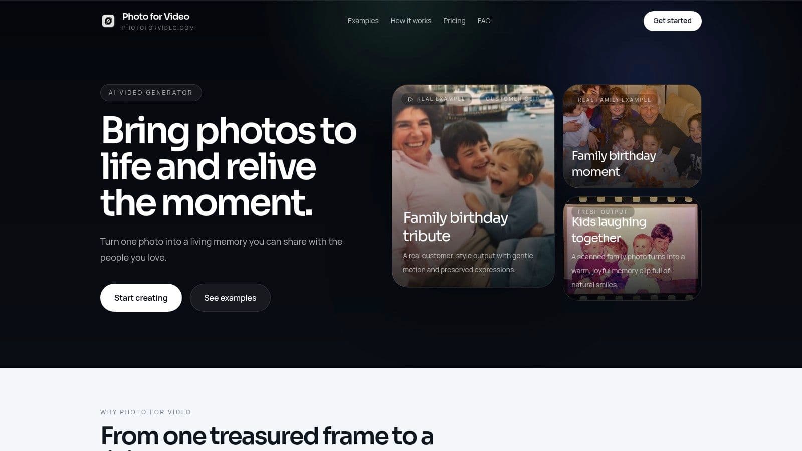
If you've turned a treasured photo into something more expressive and want to bring it to life gently, Photo for Video is built for that next step. It helps you transform one still image into a short living memory with natural movement that suits birthdays, anniversaries, memorials, and family keepsakes, without pushing the image away from the feeling that made you save it in the first place.