How to Make a Picture Look Old: A Complete Guide
Learn how to make a picture look old with easy mobile apps or Photoshop. This guide covers sepia tones, film grain, scratches, and animating your final image.

You're probably staring at a photo that means more than the pixels on the screen. Maybe it's a portrait you want to match with a family archive, a wedding shot you want to turn into something heirloom-like, or a memorial image that needs the softness and gravity of age. The frustrating part is that most “vintage” filters make a picture look edited, not old.
A believable antique look comes from restraint. Old photographs usually don't read as old because of one effect. They read as old because several traits line up at once: muted tonality, reduced contrast, warmth or monochrome toning, edge darkening, grain, and physical wear. When those details support each other, the image starts to feel like it belongs to another era instead of pretending to.
Table of Contents
- Why We Cherish the Old Photo Look
- Building the Look Toning and Color Grading
- Adding Character Film Grain Scratches and Fading
- Editing Workflows for Mobile and Desktop
- Animating Your Aged Photo with Living Motion
- Frequently Asked Questions About Creating Vintage Photos
- Can I make a modern high-resolution photo look old?
- What's the biggest mistake to avoid?
- Should I use black and white or sepia?
- How much grain is too much?
- How do I make borders look old?
- Can I do this on my phone and still get a good result?
- Should scratches cover the whole image?
- What if my edit looks flat instead of old?
Why We Cherish the Old Photo Look
The old photo look carries emotional weight because it changes how a moment feels. A clean digital image says “present.” A carefully aged image can suggest memory, distance, loss, family history, or romance. That's why people reach for it when they're making anniversary tributes, memorial slideshows, or gallery walls that blend new prints with inherited ones.
The mistake is treating that feeling like a preset. It isn't. Adobe's vintage editing guidance recommends stripping away modern color cues, lowering contrast, adjusting brightness, and then adding traits like sepia, monochrome noise, and vignette because older photographs often have less contrast and more visible aging artifacts than modern captures (Adobe's vintage photo workflow). That's a useful baseline because it points to something many beginners miss. Age is built from multiple changes working together.
Practical rule: If the image still looks clinically sharp, perfectly even, and digitally clean after you desaturate it, it won't feel old.
There's also a storytelling side to this craft. A family snapshot from the 1940s shouldn't wear the same treatment as a faded 1970s drugstore print. One wants monochrome or sepia with softer edges. The other may want warmth, lower saturation, and the faint unevenness of consumer film. The more closely you match the material limits of older cameras, film stocks, and paper prints, the more convincing the result becomes.
Aging a photo also means deciding what doesn't belong. Modern objects can break the illusion fast: earbuds, LED signs, polished cars, synthetic fabrics, bright plastic. Removing those details often matters as much as color grading. Even a modest cleanup can shift a modern portrait into something that feels plausibly archival.
What gives an image that antique signal
- Muted contrast: Old prints rarely have the punch of a new smartphone file.
- Period-appropriate toning: Black and white, sepia, or a restrained warm cast usually works better than trendy filter color.
- Surface imperfection: Grain, dust, paper texture, and slight edge wear suggest a physical object with history.
- Selective cleanup: Removing modern distractions protects the illusion.
- Gentle falloff: Darker corners and softer edges can mimic both lens behavior and print aging.
What makes this satisfying is that the process is learnable. You don't need a lab, a darkroom, or a stack of old negatives. You need a believable tonal base, discipline with texture, and a sense of what the image is supposed to feel like when you're done.
Building the Look Toning and Color Grading
Tone does the heavy lifting. If the photo still has the crisp contrast, clean whites, and aggressive color separation of a current phone image, scratches and dust will sit on top like a costume.
Choose the print history you want
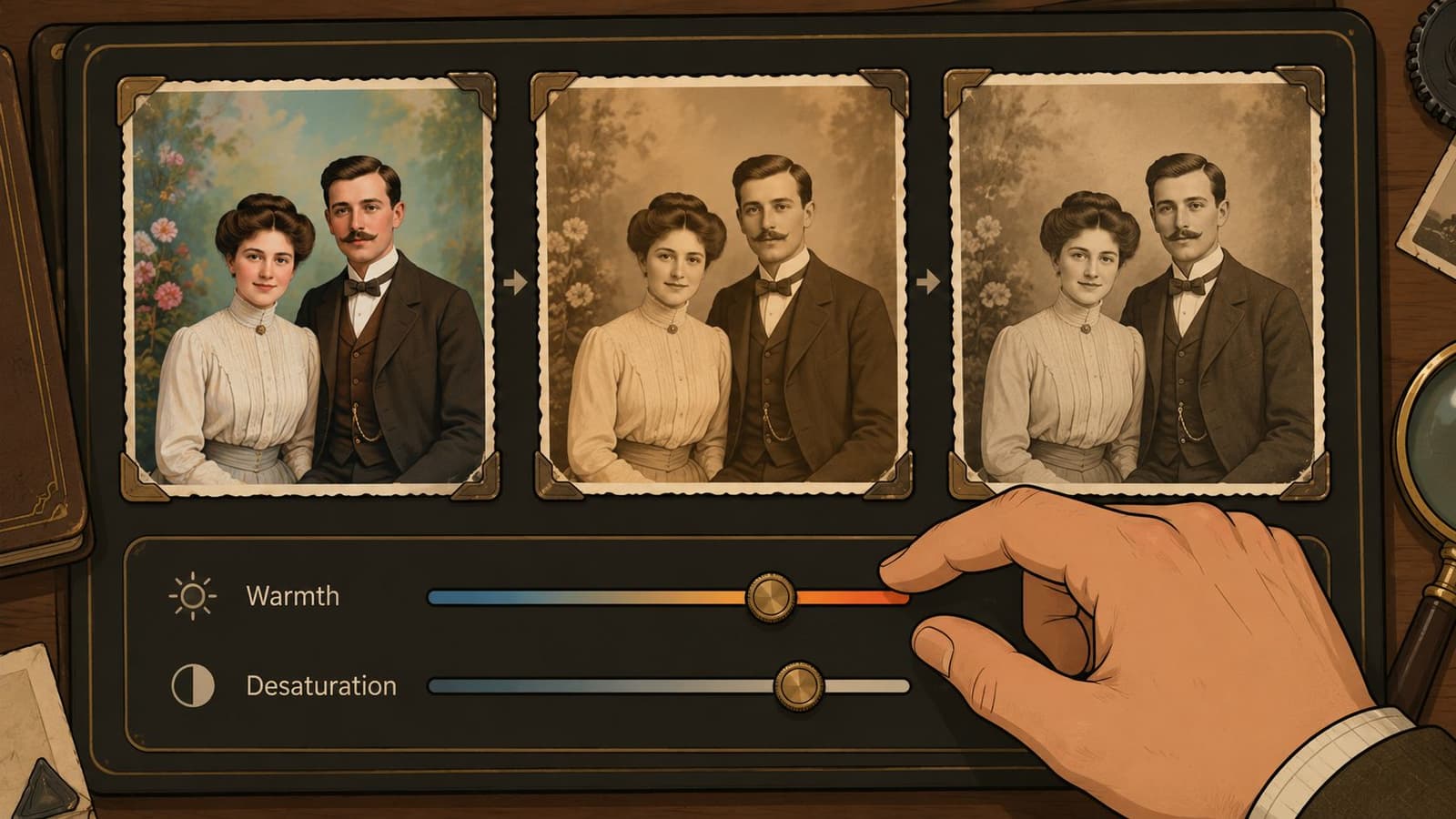
Start by deciding what kind of object this image is supposed to become. A formal family portrait usually wants a restrained monochrome base or a light sepia wash. A mid-century snapshot often works better with faded color, weak blacks, and yellowed highlights. Those are different jobs, and they need different slider choices.
Warmth helps, but it needs control. Push white balance too far and skin turns orange. Leave it too neutral and the file keeps its digital cleanliness. On many edits, a gentle move toward warm highlights and slightly dirtier whites is enough to suggest age without shouting "filter."
Screen accuracy matters here. A cool display can trick you into over-warming the file, then the image looks muddy everywhere else. If you edit across devices, this guide to image color calibration for editing screens helps keep your grade consistent.
Set the tonal base before you stylize color
Work in this order:
-
Reduce contrast first
Pull the image away from modern punch. Keep detail in the shadows and stop the highlights short of pure white. -
Raise the black point slightly
Old prints and scans often have a soft floor in the shadows. In Curves, a small lift usually looks more convincing than a heavy fade slider. -
Compress the brightest areas
Bright foreheads, shirts, and skies should roll off gently. Harsh digital highlights make a vintage treatment fall apart fast. -
Mute color by channel, not only globally
Blues and greens usually date an image fastest because modern sensors render them cleanly and intensely. Pull those back first, then decide whether reds and yellows need a smaller correction. -
Commit to one color direction
Monochrome, sepia, or muted warm color each has a clear identity. Combining all three weakens the result.
Soft contrast reads older than soft focus.
Three color directions that hold up
| Look | Best for | What to do |
|---|---|---|
| Black and white | Portraits, memorial images, formal scenes | Remove color, soften contrast, and keep highlight detail intact |
| Sepia print | Heritage portraits, staged vintage treatments | Convert to monochrome first, then add a restrained brown tone |
| Muted warm color | Mid-century or film-inspired images | Warm the image slightly, reduce saturation, and let some faded color remain |
A good grade still protects the subject. Eyes need shape. Fabric needs some separation. Hands should not disappear into lifted shadows.
I usually stop color work when the image feels printed rather than processed. That distinction matters later if you plan to animate the final frame in Photo for Video. A stable tonal base gives the motion room to breathe and lets the grain, fading, and surface wear hold together like part of the photograph instead of breaking apart once the image starts to move.
Adding Character Film Grain Scratches and Fading
Once the tone is right, texture can do its job. At this point, the photo stops looking color-graded and starts feeling handled, printed, scanned, stored, and found again.
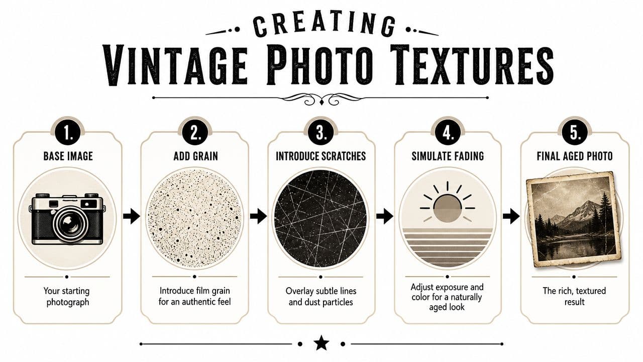
A sturdy editing sequence is to warm the white balance first, around 3000–4000K, reduce saturation, lift blacks a touch, and keep the vignette subtle before adding dust, scratches, edge burning, or paper texture (technical old-photo workflow). That order matters. Texture looks more believable when it sits on top of a settled tonal foundation.
Texture should support the subject
Real aging is uneven. Corners wear faster than faces. Borders collect damage. Print surfaces crease in one area and stay cleaner in another. That's why a full-frame distress overlay almost always looks synthetic.
Use grain to suggest the capture medium. Use scratches and dust to suggest the physical object. Use faded edges to suggest time and handling. Those are three different jobs.
A practical way to think about each one:
- Grain belongs to the image itself
It should feel embedded, not sprinkled on top. - Dust and scratches belong to the print or scan
They should be irregular and sparse. - Fading belongs to exposure, chemistry, and storage
It should alter edges, color balance, and density in a less predictable way.
What usually goes wrong
Most failed edits share the same problems.
- Too much vignette: Heavy dark corners announce “filter.”
- Uniform scratches: Real wear isn't evenly distributed.
- Digital noise instead of film grain: Random harsh speckle feels electronic, not photographic.
- Texture over the face: Damage should usually stay away from the key features unless you're copying a distressed print.
- Over-desaturation before texturing: The image becomes flat before it becomes old.
If viewers notice the scratches before they notice the person, the effect is too strong.
Paper and fabric textures can help more than people expect because they create a physical substrate under the image. A subtle paper tooth, especially with gentle blend modes, gives the eye a reason to believe the file came from a print. Edge burn can help too, but keep it irregular. Symmetry is the enemy of realism in this stage.
For mobile editors, texture overlays in apps like Snapseed, Lightroom Mobile, or even layered design apps can work if you lower opacity and erase around the subject. For desktop work, masks make all the difference. You want control over where age appears, not just whether it appears.
Editing Workflows for Mobile and Desktop
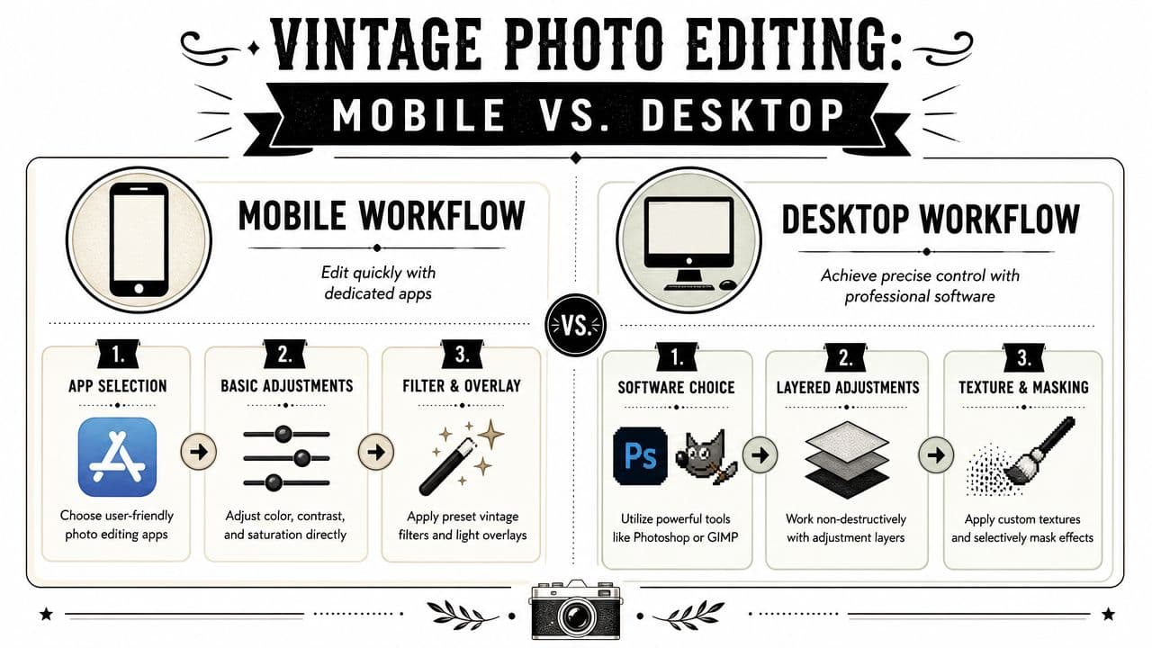
A good vintage edit can fall apart in the last five minutes. The tone looks right, the grain feels convincing, then one heavy texture pass or one sloppy mask turns the image into an obvious filter. The workflow matters because each tool pushes you toward a different kind of result. Phones are fast and forgiving. Desktop apps give you the control that keeps aging believable.
A fast mobile workflow
Mobile editing works best when the file already has a decent foundation. A clean portrait, soft natural light, and simple background all age better than a cluttered phone shot with blown highlights.
Snapseed and Lightroom Mobile are practical choices because they cover the core moves without forcing you into a canned preset. Start by cleaning distractions. Remove logos, bright plastic objects, or anything that dates the image in the wrong way. Then set the direction early. Choose black and white, sepia, or muted color before adding texture, because grain behaves differently once the palette is locked.
A reliable mobile sequence looks like this:
- Clean up first: Heal dust spots, exit signs, power cables, and other modern details.
- Set tone and color: Lower contrast, pull back saturation, and soften highlights.
- Adjust local areas: Darken a bright background or lift a face if the subject is getting lost.
- Add restrained grain: Enough to break the polished phone look, not enough to make skin gritty.
- Introduce one age cue: A border, light dust, or faint paper texture is usually enough.
- Finish with a small vignette: Keep it irregular and weak so it supports the frame instead of calling attention to itself.
Source quality decides how far a mobile edit can go. If the image came from a family album, start with a clean scan instead of editing a crooked photo of a print. This guide on scanning old photos for cleaner restoration and vintage edits will save time before you touch the sliders.
A desktop workflow with more control
Desktop editing is slower, but it gives you the kind of control that makes an aged image feel physically handled instead of digitally processed. Layers matter. Masks matter more.
Photoshop, Photopea, Affinity Photo, and GIMP all let you separate tone, texture, fading, and damage so you can revise one decision without wrecking the rest. That changes the quality of the final image. A scratch can sit on the border without crossing the eye. Paper texture can live in the shadows while the face stays cleaner. Highlights can fade at the edges while the center keeps shape.
A dependable layer order looks like this:
-
Cleanup base
Remove distractions, sensor spots, and anything you do not want preserved under the aging. -
Tone adjustments
Use Curves or Levels to lift blacks slightly, soften white points, and reduce the digital snap. -
Color styling
Apply black and white conversion, sepia, or faded color as its own adjustment layer. -
Grain pass
Add monochromatic grain on a separate layer so you can control strength without shifting color. -
Physical texture layers
Place paper, dust, edge wear, or crease textures above the image and test blend modes carefully. -
Selective masking
Hide heavy wear from faces, eyes, hands, and any detail that carries the emotional focus.
The trade-off is time. A phone edit can be done in minutes. A desktop edit often takes several passes, especially if you are matching multiple family photos into one consistent set. The payoff is precision. You can age the photograph and still protect the person inside it.
Mobile and desktop side by side
| Workflow | Best when | Strength | Limitation |
|---|---|---|---|
| Mobile | You need a quick result for sharing, stories, or a casual slideshow | Fast tonal edits, built-in grain, easy selective tools | Limited masking, weaker texture placement, less control over realism |
| Desktop | You want a print-ready file, a restoration-style effect, or a matched series | Layers, masks, blend modes, better control over wear and fading | More time, more setup, steeper learning curve |
Choose the workflow based on the job, not the app you already have. Mobile is enough for a simple memory piece. Desktop is the better route when you want the image to hold up at full size, survive close inspection, and still carry those analog textures when you animate it later.
Animating Your Aged Photo with Living Motion
A well-aged still image already carries memory. Motion changes the experience again. A slight head turn, a gentle camera drift, or a soft breath-like movement can make an old-style portrait feel less like a graphic effect and more like a moment that's returning.

The important part is preserving what you built. Many animation workflows smooth, sharpen, or reinterpret an image so aggressively that the grain, scratches, and faded edges disappear. That defeats the point. If you spent time shaping analog texture, the motion step should respect it rather than “correct” it.
Motion only works when the aging survives
The best animated vintage images keep their surface character. Grain should still read as grain. Soft focus should stay soft. Borders and edge wear should remain part of the frame's identity.
That's why it helps to start with a finished aged file rather than asking an animation tool to create the aging for you. Build the old-photo look first. Flatten or export a clean master copy. Then animate the result with a tool designed for photo-based motion, such as Photo for Video's image animation workflow.
Good prompts for this kind of image are gentle and specific. Ask for slight facial motion, a soft camera push, or subtle environmental stillness. Don't ask for dramatic gestures. The old-photo effect and the motion should support the same emotional tone.
Keep the movement quieter than you think you need. Vintage images gain power from restraint.
How to prep the file before animation
Before you animate, check these details:
- Finish the texture pass first: Don't plan to add scratches after motion unless you're comfortable compositing video overlays.
- Keep the subject clear: Eyes and facial contours need enough definition for natural movement.
- Avoid excessive damage on key features: Heavy creases through the mouth or eyes can confuse motion interpretation.
- Save a full-resolution version: You may want one file for animation and another for print or slideshow use.
Once your still is ready, motion can turn it into a keepsake with a different emotional register. That's especially powerful for birthdays, anniversaries, family memorials, and tribute montages, where a single image sometimes needs to carry a lot of feeling.
A short example of the effect in motion helps make the point:
The difference is subtle but meaningful. Aged texture gives the photo history. Motion gives it presence.
Frequently Asked Questions About Creating Vintage Photos
Can I make a modern high-resolution photo look old?
Yes, but you have to remove the things that announce modern capture. That usually means reducing clarity, lowering contrast, muting color intensity, and cleaning up contemporary objects or styling cues. High resolution isn't the problem. Untouched modern sharpness is.
What's the biggest mistake to avoid?
Adding distress before building the tonal base. If the image still has bright modern contrast and polished color, scratches won't make it feel old. They'll just make it feel damaged.
Should I use black and white or sepia?
Use black and white when you want formality, gravity, or an early archival mood. Use sepia when you want warmth and print-like nostalgia. If the scene needs to feel later in the film era, a muted warm color grade often works better than either.
How much grain is too much?
Too much grain makes skin and fabric look crunchy instead of photographic. Grain should read as part of the capture, not as static poured over the image. If it distracts from the face at normal viewing size, back it down.
How do I make borders look old?
Use uneven edges, faint paper discoloration, and localized wear rather than a perfect decorative frame. Real borders tend to age at corners and along handling points. A border that looks too symmetrical often feels like a template.
Can I do this on my phone and still get a good result?
Yes. A phone workflow can look excellent if you keep the recipe simple: tone first, then grain, then one or two physical aging cues. Mobile edits usually fall apart only when too many effects stack up.
Should scratches cover the whole image?
Usually no. Scratches and dust are more convincing when they live near edges, corners, and less important background zones. Keeping the subject cleaner preserves realism.
What if my edit looks flat instead of old?
Bring back a little structure. Old photos are often softer and less contrasty, but they still have a readable subject. Raise local separation in important areas without restoring the modern digital crispness you were trying to remove.
If you've finished aging a meaningful image and want to turn it into something even more personal, try Photo for Video. It can transform a single finished photo into a short living memory while preserving the vintage texture and mood you worked to create.