A Guide to Uncanny Valley Animation and How to Avoid It
Learn what uncanny valley animation is and why it makes moving photos feel creepy. Get practical tips to avoid it, especially for family tribute videos.
You're probably here because you have a photo you care about. Maybe it's a faded portrait of a grandparent, a wedding print with soft grain, or a phone snapshot of someone you miss. You want to see that face come alive for a moment. A blink. A small smile. A gentle turn of the head.
And you're worried it might come out wrong.
That worry has a name. It's the uncanny valley, and in animation it describes the point where something looks almost human, but not quite enough to feel comfortable. That gap matters even more when the image isn't just content. It's a memory.
For family tribute creators, the challenge isn't only making motion. It's making motion that still feels like the person in the photo. If you've hesitated because you don't want a cherished image to look creepy, your instinct is sound. In one study, 15% of semirealistic animation films were chosen as “most liked,” while 7% were ranked “most disliked” for their eerie quality, according to research summarized in this ScienceDirect article. That doesn't mean you should avoid animation. It means you should approach it with care.
If you're just starting, it helps to first understand how to animate a photo naturally before chasing realism for its own sake.
Table of Contents
- The Hope and Fear of Animating a Cherished Photo
- What Exactly Is the Uncanny Valley in Animation
- Why We Feel That Creepy Sensation
- Famous Examples from Animation History
- A Practical Checklist to Avoid Uncanny Results
- Special Guidance for Animating Old and Scanned Photos
- Focus on Feeling Not Flawless Realism
The Hope and Fear of Animating a Cherished Photo
A family member finds an old print in a drawer. The corners are worn. The scan isn't sharp. But the expression is perfect. It captures the person exactly as they're remembered. Warm, calm, familiar.
That's the kind of image people most want to animate, and it's also the kind that can feel most vulnerable.
When a tribute creator says, “I want it to feel moving, not strange,” they're identifying the true objective. The risk isn't merely poor animation. The risk is creating a moment that pulls viewers out of the memory instead of drawing them closer to it.
What people are reacting to
The uncomfortable reaction usually shows up fast. You look at the animated result and think: the face is close, but something feels off. Not wrong in an obvious way. Wrong in a subtle way that's harder to explain.
That feeling is common with near-human visuals. It tends to appear when a creator tries to add lifelike movement to an image that wasn't built for motion in the first place.
A tribute works when viewers feel recognition before they notice technique.
For family videos, that's an important shift in mindset. You're not trying to prove that a still photo can be turned into a perfect live-action clip. You're trying to preserve the emotional truth of the original image.
Why caution is wise
People sometimes assume the solution is “more realism.” In practice, that can make things worse if the details don't agree with each other. A face may look soft and vintage, while the movement feels crisp and synthetic. That clash is where trouble starts.
The good news is that uncanny valley animation isn't random. It follows patterns. Once you understand those patterns, you can make choices that feel respectful, restrained, and much more natural.
What Exactly Is the Uncanny Valley in Animation
The idea began with Dr. Masahiro Mori in 1970, when he proposed that our emotional response rises as something becomes more human-like, but then drops sharply just before full realism. A summary of Mori's theory in the Los Angeles Film School explanation of the uncanny valley describes this steep dip in affinity just before something appears fully human.
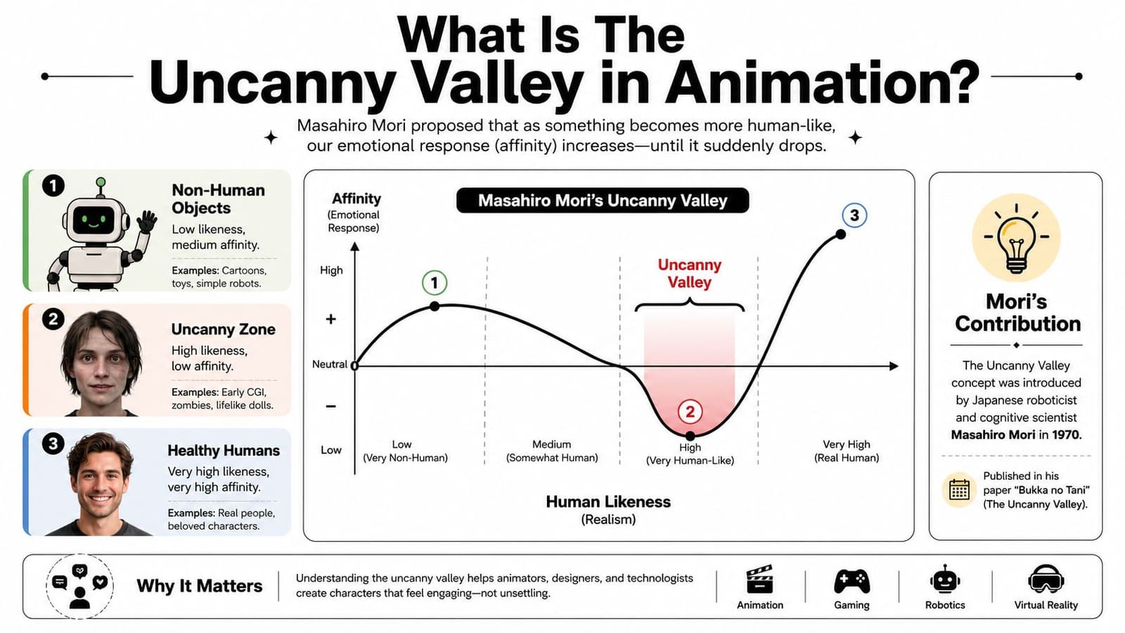
A simple way to picture the curve
Think of three characters:
- A stick figure: Nobody mistakes it for a real person, but it can still feel appealing.
- A real human: No problem here. The brain recognizes a living person and relaxes.
- An almost-human digital face: This is the risky zone. It's close enough to trigger human expectations, but not accurate enough to satisfy them.
That middle zone is the valley.
The reason it matters in animation is that the brain doesn't judge “human” in a general way. It checks for many tiny signals at once. Skin, eyes, timing, posture, expression, motion. If those signals line up, the character feels alive. If they conflict, the viewer feels distance.
Why near-real can feel worse than stylized
A cartoon doesn't usually bother us because it isn't pretending to be a perfect human replica. We accept the visual language quickly. A highly realistic animation can also work if everything supports the illusion.
The discomfort tends to appear in between. That's where the face asks to be read as real, but some detail keeps interrupting that reading.
Practical rule: The closer you move toward realism, the less room you have for inconsistency.
Many readers get confused. They think the problem is realism itself. It isn't. The problem is near-realism without full agreement across the details.
What this means for memory-based animation
When you animate a cherished photo, you aren't starting from a clean 3D character model. You're starting from a flat image that already carries texture, age, lighting limits, and missing visual information. That means the animation has to be especially disciplined.
For a family keepsake, the goal isn't to climb as high as possible on the realism scale. The goal is to stay in a zone where the image still feels coherent, kind, and recognizable.
Why We Feel That Creepy Sensation
The eerie feeling doesn't happen because your brain is being overly picky. It happens because your brain is excellent at reading human signals. Small mismatches stand out fast, especially in faces.
According to the Wikipedia overview of the uncanny valley, the effect is significantly amplified by movement, and people hyper-fixate on tiny kinetic details such as eye-blinking rates. When those details are slightly off, the brain registers cognitive dissonance and revulsion.
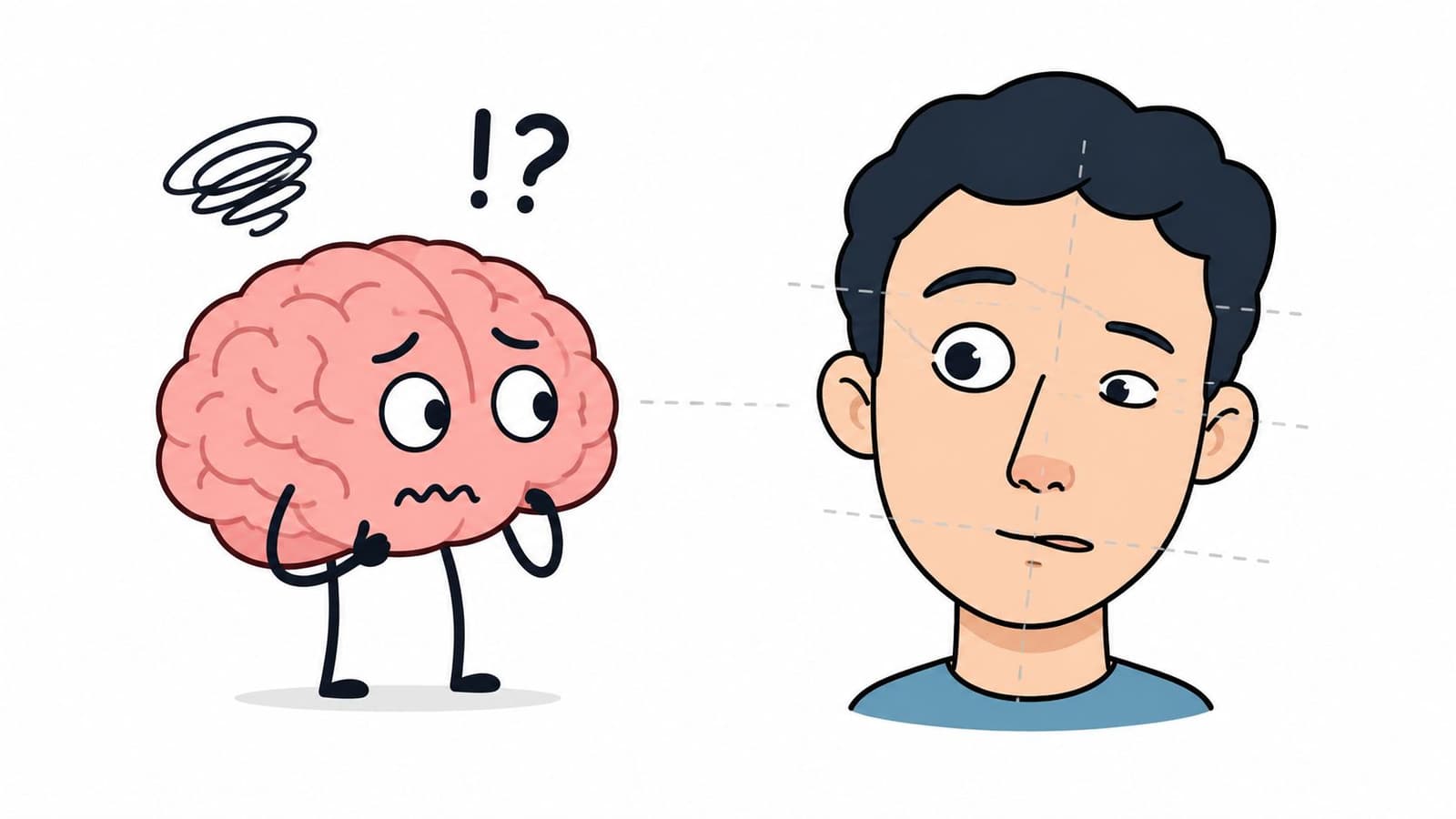
Motion turns suspicion into certainty
A still image can hide a lot. If the portrait is almost believable, your mind may fill in the gaps on its own. The moment that portrait blinks, shifts, or smiles, the test gets harder.
Movement reveals what the still image was concealing.
If the eyelids close with odd timing, if the mouth changes shape without supporting cheek movement, or if the head glides instead of carrying natural weight, the viewer senses that the parts aren't working together.
The brain wants living patterns
Human beings are used to reading faces in fractions of a second. We notice when someone looks tired, distracted, happy, or unwell. That same sensitivity makes us react strongly when an animated face carries signs of life and signs of lifelessness at the same time.
Common triggers include:
- Eyes with the wrong rhythm: Blinks that feel mechanical or delayed often create instant discomfort.
- Skin with a plastic quality: Surfaces that are too smooth can feel less alive, especially if the original image had natural texture.
- Motion without physical logic: Limbs, shoulders, or head turns that drift without believable weight can break trust.
The viewer usually can't name the flaw. They just feel that something isn't human in the right way.
Why this matters more in emotional projects
In a fun experimental clip, a little awkwardness may be acceptable. In a memorial or anniversary video, viewers are more emotionally open. That makes them more sensitive, not less.
They aren't watching to admire technique. They're watching to reconnect with a person. If the animation introduces even a slight sense of vacancy, the emotional tone changes immediately.
That's why restraint often produces better results than ambition. A tiny, believable motion can feel tender. A large, overconfident motion can feel theatrical or eerie.
Famous Examples from Animation History
Animation history is full of creators learning this lesson the hard way. Audiences have long accepted stylized worlds, exaggerated characters, and expressive designs. They become uneasy when a production pushes toward human realism without fully solving skin, motion, and expression.
One of the smartest responses came from Pixar's early strategy. As explained in Verywell Mind's discussion of the uncanny valley, Pixar initially minimized human characters because rendering skin without it looking like plastic was a huge technical hurdle, so the studio leaned into stylized aesthetics instead of risking a “soulless” result.
The lesson behind stylization
That choice wasn't a shortcut. It was good design judgment.
Toys, monsters, fish, and cars gave animators freedom. Those characters could move expressively without being judged against the full complexity of real human skin and facial behavior. Viewers accepted the visual rules because the films presented a consistent world.
By contrast, early near-human digital characters often landed in a dangerous middle area. The features were detailed enough to invite close scrutiny, but not unified enough to feel alive.
What family creators can borrow from studios
You don't need a feature-film pipeline to use the same principle. The lesson is simple: choose a visual promise you can keep.
If the original photo is soft, aged, and textured, don't force a hyper-clean performance on top of it. If the face has limited detail because of scan quality, don't ask it to perform a broad emotional range. A modest result that respects the image will usually feel better than a bigger effect that overreaches.
Studios learned that empathy often comes from design consistency, not maximum realism. That's just as true when the “character” is your own grandfather in an old portrait.
A Practical Checklist to Avoid Uncanny Results
The safest approach is to treat uncanny valley animation like a set of guardrails. You don't need perfect realism. You need harmony between appearance, movement, and feeling.
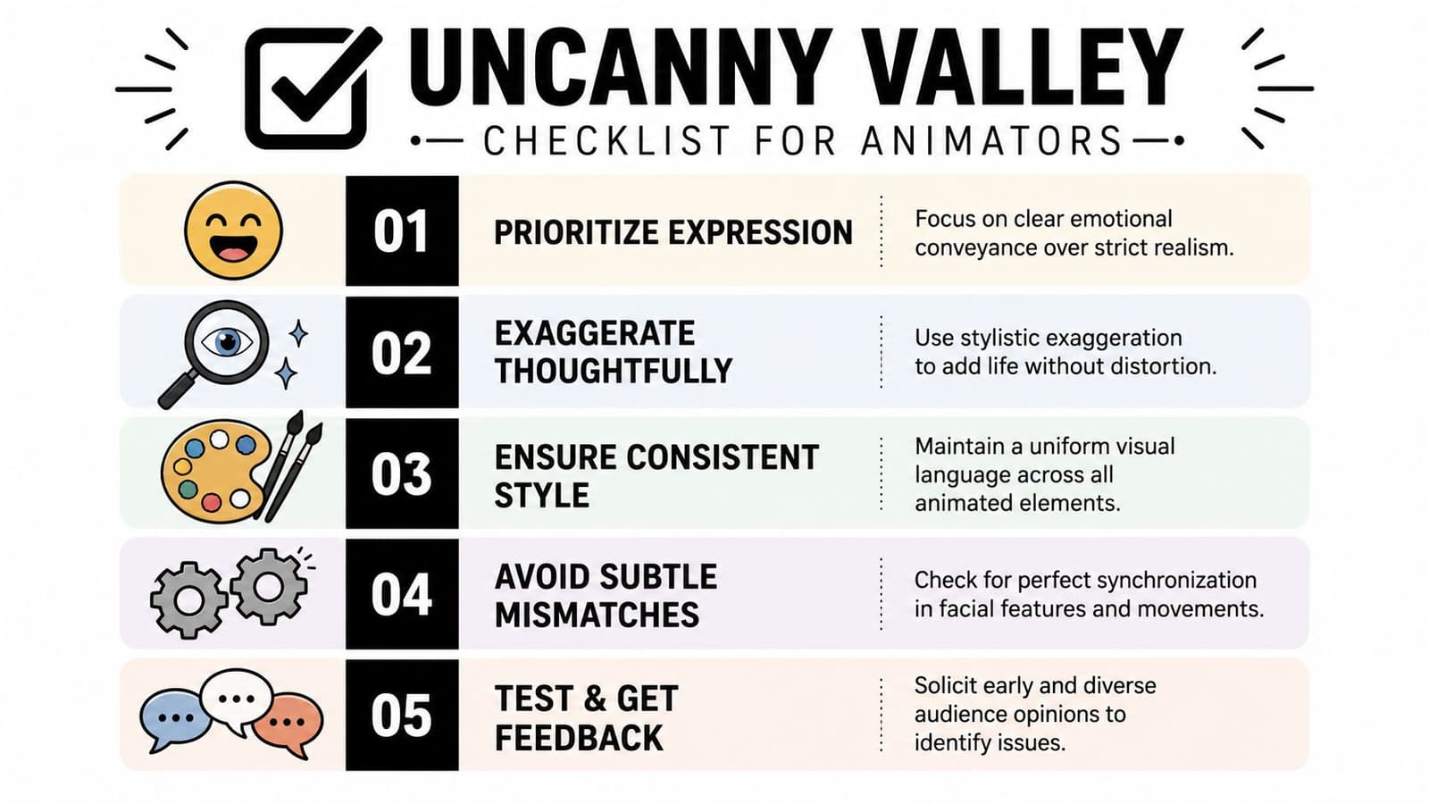
Keep movement smaller than your first instinct
Most uncanny results are too assertive. The head turns too far. The smile grows too much. The blink becomes the whole event.
Try these guardrails instead:
- Start with one motion: A blink, a breath-like shift, or a slight head turn is often enough.
- Favor gentle timing: Human movement usually eases in and out. Sudden starts can feel robotic.
- Let the pose do the work: If the original expression is already strong, the animation only needs to support it.
A useful companion step is improving the source image before you animate it. If the scan is muddy or damaged, improving the quality of the photo first can help the final motion feel more coherent.
A short visual example helps here:
Treat the face as one system
People often focus on a single feature, usually the eyes. But the face is a coordinated system. If one part moves, nearby parts should support that motion.
Use this mental checklist:
- Eyes: Natural direction matters more than dramatic movement.
- Mouth: Subtle changes beat full speech-like motion for still-photo animation.
- Cheeks and brow: Expression should spread softly, not appear pasted onto one area.
- Head position: Small shifts should feel connected to neck and posture, not floating independently.
If one feature looks highly animated while the rest of the face stays still, viewers notice the mismatch immediately.
Use this quick do and don't table
| Do | Don't |
|---|---|
| Use restrained movement that fits the original pose | Force large gestures just to make the clip feel active |
| Keep textures consistent with the source photo | Over-smooth skin until it looks waxy or plastic |
| Match emotion to the original expression | Invent a new expression the photo never suggested |
| Test the clip with another person before using it in a tribute | Assume your own familiarity makes awkward details invisible |
| Choose coherence over realism | Mix soft vintage detail with crisp synthetic motion |
A good result often feels almost understated on first watch. That's a sign you're protecting the memory instead of overpowering it.
Special Guidance for Animating Old and Scanned Photos
Old photos bring a different challenge than modern portraits. They contain film grain, paper texture, faded contrast, soft focus, and sometimes scratches or uneven scanning. Those qualities are not defects to erase. They are part of the memory's visual identity.
Research summarized in this PubMed Central article on perceptual mismatch and humanlike figures shows that uncanny feelings often come from perceptual mismatch, where realism levels don't agree. In practice, animating a low-resolution vintage photo with crisp digital motion can feel unsettling because the new movement conflicts with the original analog texture.

Why old photos are a special case
A modern image usually has enough detail to support cleaner motion choices. An older scan often doesn't. The eyes may be soft. The edges of the face may blur into the background. The lighting may be flattened by age or paper.
That means every added movement has to respect missing information.
If you add highly polished eye motion to a grainy portrait, the motion can look like it belongs to a different image. If you animate the mouth too clearly on a faded print, the result can feel detached from the face around it.
How to preserve memory instead of forcing realism
The solution is not to strip away the old-photo quality. It's to make your movement choices feel compatible with it.
Here are the most reliable approaches:
- Embrace the scan's character: Keep the softness, grain, and age marks if they contribute to recognition.
- Limit the action: A tiny blink or slight camera drift often suits vintage photos better than expressive performance.
- Honor the original pose: If the person looked serious in the photo, don't manufacture a cheerful smile.
- Scan carefully before animating: Better input gives you cleaner choices later, especially with old prints. This guide on how to scan old photos is a practical starting point.
- Think “living memory,” not “digital resurrection”: The best tribute animations suggest presence. They don't try to replace reality.
Old photos already carry emotional texture. The animation should support that texture, not fight it.
This is the part most general uncanny valley advice misses. It talks about realism too broadly. For family tribute creators, the sharper issue is consistency. A memory feels safe when all its parts seem to belong together. It feels uncanny when one part suddenly belongs to a different visual world.
Focus on Feeling Not Flawless Realism
The best uncanny valley animation advice is also the gentlest. Don't chase perfection. Chase recognition.
A successful tribute clip doesn't need to fool anyone into thinking a still photo became live footage. It only needs to create a brief, believable sense of presence. When the movement matches the image, the texture, and the memory, viewers stop evaluating the technique and start feeling the person again.
Subtle choices are often the most loving ones.
If you want to turn a cherished still image into a short, natural-looking keepsake, Photo for Video helps you create a gentle living memory from a single photo while preserving the original image's character.